How to Use Photoshop Color Profiles for Web Images
I’ve noticed lately that some web designers don’t seem to be using color profiles correctly in Photoshop. If you’ve ever saved images for the web and discovered that they come out slightly lighter and more desaturated than what you saw when you worked on them, this guide is for you.
There are some blog posts that advocate disabling color profiles in web images to “fix” this problem. This isn’t the right way to go about it because modern browsers like Firefox 3 and Safari do use color profiles, so you can get much better results by using them correctly. What’s more, color profiles are dead simple to use. Here’s how…
NOTE: The following instructions are for Photoshop CS3 running on OS X, but it will be the same for Windows and similar for older versions of Photoshop.
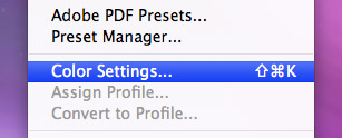
First, we need to know what profile to use for your web images — that’s the sRGB IEC61966-2.1 profile. It is standard across many PC monitors and so is recommended for use on the web. To set your working space to this profile, open up the “Edit” menu, and click on “Color Settings…”

You’ll be presented with the following options:

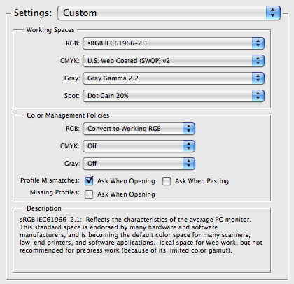
Look at the “Working Spaces” section and select the sRGB IEC61966-2.1 profile from the RGB drop-down. The other settings aren’t relevant here since we’ll only be working with RGB for web images.
Now you’ve got the working space set up correctly, but we’re not done. What you see now isn’t what you’ll see when you save the image for the web because what you see isn’t affected by your monitor settings — to see the “real” colors we need to use color proofing.
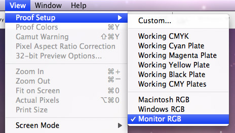
Click on the “View” menu and then on “Proof Setup”. You should see another selection. We want to see the image as it will appear on our monitor, so select “Monitor RGB” at the bottom.

Finally, we need to activate color proofing as it is off by default. Click on the “View” menu again, and click on “Proof Colors” if there is no check already next to it.

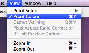
Once you click on it, it will be checked indicating that the colors are now being proofed using your monitor settings. That’s it, what you see now on your screen will be pretty much what you’ll get when you save the image.
People will still see the colors slightly differently across many devices and operating systems (for example, default OS X gamma differs to the standard Windows PC gamma, so images are a little brighter — if you are working on a Mac it is advised to set your gamma level to 2.2) but the output will still be consistent with your working space and will be ready for modern browsers that do use embedded color profiles.
30 Jul, 2008
Awesome. ive been wondering about that for a little bit now. thanks. found your post through design float, ill have a longer look around your site. awesome so far. thanks again.
30 Jul, 2008
Thanks Travis, I’m glad you found this useful.
One thing to note is that the “Proof Colors” mode is off by default on every new image, so you have to make sure to turn it on — can use a shortcut (Command+Y on OS X or Control+Y on Windows). I’m not a Photoshop guru so not sure if it’s possible to turn it on by default.
31 Jul, 2008
ohh, thats a really good post, extremly helpful, im glad you posted thanks.
Max | Design Shard
31 Jul, 2008
This tutorial is recommended reading for anyone who designs for screen.
Thank you Dmitry.
31 Jul, 2008
Personally, I just turn off all colour management. That way what’s on screen, is just the way it will be in your browser.
Does this offer any advantages?
31 Jul, 2008
Well, I´ve been working with web images for the last few days, so this has been a great help. Good Blog!!
Un abrazo y saludos desde Guadalajara, México.
31 Jul, 2008
Thanks everyone for the positive comments.
Kevin — good question :) A lot of browsers right now don’t use color profiles, but the newer ones do (Safari by default, and Firefox 3 if you turn it on). Basically, your colors should be richer and stronger with profiles (though you’ll only see the difference in a modern browser).
Here are two great links with lots of example comparison images:
http://www.gballard.net/psd/go.....files.html
http://www.dria.org/wordpress/.....04/29/633/
I think it’s not crucial for you to use color profiles today, but as they will be used by all browsers in the future, I think it’s a good idea to know how to set them up.
1 Aug, 2008
Great just what I was looking for!
I always make sure my “new document” in Photoshop uses sRGB2.1 as well but didnt know about the “View > Proof Setup”.
I tend to turn off Proof Colours now though so that it looks the same as the Windows version since most of my clients are on Windows I know how it will look while designing.
1 Aug, 2008
Dimitry - thanks for the explanation. I’ll read up on that with a view to doing it in the future.
3 Aug, 2008
Thanks for this usefull informations…
4 Aug, 2008
Thank you for this tips. Very helpful.
4 Aug, 2008
Thats cool, I was wondering if i set this up will i have to change it every time i want to use the color settings for print? can I save the two diff setups? or even three setups with the PSCS3 standard saved?
4 Aug, 2008
Hi Gavin,
Don’t think there is a faster way to switch color profiles than through the Color Settings menu under the “Edit” menu.
You can save the different settings you change in that menu for future use — however you’ll have to go back to Color Settings to switch to them though. Not amazing, but it’s not too bad either.
5 Aug, 2008
A great way to switch between color profiles and apply it to all your Adobe Applications is doing the color setting with Adobe Bridge: Open Bridge > Edit > Adobe Suite Color Settings >> Choose, Adobe North “America web/Internet”(web settings) or choose “North America Prepress” (Print Settings)
*The setting you choose will be applied to all your Adobe Applications.
6 Aug, 2008
Thank you thank you thank you from another grateful reader. This just saved me a year’s worth of head scratching and adjustment making. You rock!
7 Aug, 2008
High 5*
Thanks dude.
15 Aug, 2008
Thank you, quite a useful post.
15 Aug, 2008
loswl that’s a useful tip — thanks.
Thanks for the positive comments everyone, I’m happy this post was helpful.
30 Aug, 2008
Thank you! I’ve been looking for this solution for such a long time and finally its here… I’m working with mostly web interfaces using both PC and Mac, the color problems always making things complicated all the time.
2 Sep, 2008
i’ve been looking for this for such a long time. thanx a lot man
8 Sep, 2008
Thanks for this. I’ve been struggling with this issue for sometime now. I usually ended up over saturating my images before saving them to make them look normal when i saved them for the web.
9 Sep, 2008
That’s what was messing them up! I’ve been wondering what the hell it was, thanks!
12 Sep, 2008
Amen.
20 Sep, 2008
Hmmm, great post, but shouldn’t you give cred to the pros posting on said blog about disabling color profiles? Heh.
22 Sep, 2008
Hello webmaster , Your blog post about photoshop is absolutely great. Easy to understand it and with excellent value. I just stumbled up and dugg your site to digg as good news article about photoshop on Monday . Cheers, Mike Brown , keep up the good work !
22 Sep, 2008
well done, brother
25 Sep, 2008
The issue I find with enabling Proof Colors is that your document will now appear to be a different color than the hex code that you swatch from it. if you eyedrop a color in Photoshop and then paste that hex value into your CSS document, the HTML is NOT going to match the exported .png.
In other words, with color management and “Proof Colors” enabled, you cannot accurately sample colors from your document within PS to use in your HTML/CSS document, because the raw hex has no color profile associated with it.
The solution to this would be to swatch from an exported .PNG but doesn’t that seem like a hassle?
What are the advantages for web graphics with color profiles embedded anyway? I was always under the assumption that profiles were intended for photographs exported from PS. Can you not get as “rich” or accurate colors by just starting a fresh template with no color management and making the colors appear the way you intend them to look in the first place?
14 Oct, 2008
thanks man, sorted out some minor problems I was having.
26 Oct, 2008
It was my major prob.
Solved, a BIG thanks to you.
13 Nov, 2008
[...] Usability Post是一个关于可用性设计的博客。博客文章中提到了很多技巧,比如用页面空白改进用户界面、用Photoshop颜色配置文件设计web图像等。 [...]
27 Nov, 2008
Ive been searching everywhere and was even playing around the photoshop and did exactly what you did today before I saw this post. Thank you for reassuring me my computer wasn’t the crazy one! Great tutorial!
27 Nov, 2008
Thanks for clearing up a whole load of conflicting advice around the web. I’ve been struggling to get my head around this one for ages.
Does anyone have any good advice on a workflow for picking hex refs for style guides? When you’ve finished a design is there an easy way of picking out the background and font colors for the CSS developers? Do you have to Save for web and colorpick? Or turn proofing on and use Digital Color Meter?
Somebody out there must get this right every time. Where are you!? ;o)
28 Nov, 2008
[...] are still rather mysterious. I’ve now crossed RGB color profiles off that list when I found this consise and easy to read post on how to accurately reproduce color when exporting for the [...]
18 Dec, 2008
[...] Usability Post是一个关于可用性设计的博客。博客文章中提到了很多技巧,比如用页面空白改进用户界面、用Photoshop颜色配置文件设计web图像等。 [...]