 Traditional user interface (UI) principles dictate that you should keep your UI elements consistent. If you’ve used this navigation here, use the same format in the other places. This allows people to become familiar with your UI and thus, logic dictates, make it easier to use. But keeping things consistent may not be the best way to go in many cases.
There is something very important we should be thinking about when designing our user interfaces. Context. Context dictates what people need, and indeed expect to see in any given UI screen.
Should actions be buttons or links? It depends on the action. Should a calendar view be in list-form or grid-form? It depends where it’s being shown and how long the time period is. Does every global navigation link need to be on every page? Do you need a global search bar everywhere? Do you need the same exact footer on each page? The answer: “It depends.”
Getting Real, 37signals
Things are much easier to understand with examples, so let’s see some pictures.
Here’s a picture of the iPhone keyboard:

On the left you have the standard iPhone keyboard, and on the right is the keyboard shown when using the Safari web browser. Notice the difference? The space bar has changed to a full stop, a slash and a “.com” key. The “Return” key is now “Go” and the first character in the extras is an “@”.
The reason for these changes are obvious. Website addresses don’t have any spaces so there’s no need for a space key. Instead, we’ve got the handy full stop, slash and a “.com” key. It makes sense to have these keys in this context. Give the user what they need, not what you have somewhere else in your app.
Here’s another example. This is from a 37signals web application called Backpack. Here are two pictures of the account settings page:
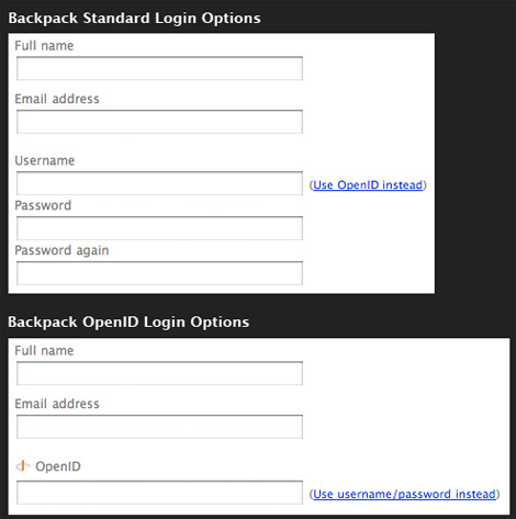
We’ve got two options when logging into Backpack. We can use the traditional username and password pair that most apps use – or we can use the modern OpenID authentication.
The screen never shows all the input fields at once though – only the ones you need. Click on the alternative login method link, and the fields switch right there in-front of you.
This method ensures the amount of information shown on the page is kept to a minimum to keep thing simple and relevant.
Here’s another example. This is the navigation bar at the top of the popular social news website Digg:
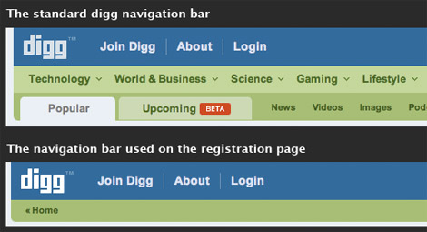
The first is the standard navigation bar used across the site. The second is the same navigation bar, but displayed on the new account registration page. Notice that all the navigation elements are gone, apart from the core links and a link back to the main content. Why were the links taken off the registration page?
Simple – the registration page is there for only one purpose: to get the visitor to make a new account. They don’t need to see any of the other content in this context. Indeed, other content may actually distract the visitor from the task at hand, which may negatively affect your conversion rate.
Digg cleverly removes navigation elements from their registration page to keep things simple and give focus to the content relevant to making a new account.
Think about what the visitor needs to accomplish their task on any given page or screen. What do they expect to see? What tools do they require? What don’t they need?
Remove the stuff people don’t need – leave only the essentials. Less clutter makes the interface easier and quicker to use because people don’t have to scan through many elements. Less clutter results in a clean interface that has clarity. Knowing what context each UI screen will be used in helps you make the decisions about what to keep and what not to.