OS X, the Mac operating system, has a pretty good font rendering engine – it adheres to the intended font proportions closely to create an image of the font on the screen that accurately depicts what you would see printed out on paper.
One complaint that I’ve read about often is that sometimes it makes the fonts a little too blurry or too fat – especially when they are bold. This is made worse when the font is colored in a light color and placed on a dark background.
If you’re designing websites for a sizable Mac audience you can use a little CSS trick to make your bold fonts look better. This involves the “text-shadow” CSS property and will only work in the Safari browser.
Have a look at the following screenshot. Here are three white fonts being rendered on a dark grey background in Safari. All the fonts are bold. You can see that the outcome isn’t very clean – the white seems to spill out, blurring the font.

Now, lets apply a “text-shadow” property to the CSS stylesheet. I’m going to apply a shadow with the same color as the background and everything else (position and blur) set to 0. Here’s the code:
text-shadow: #333 0 0 0;
Here’s what we get:
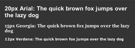
Much better! The shadow seems to have cleaned up the font a lot. It’s no longer spilling out so much, yet it is still clearly bold.
If you like, you can play around with the shadow property to get some nice effects. For example, the following image shows the shadow color set to black, the position to 1 pixel down and the blur set to 0 (text-shadow: #000 0 1px 0;)

This will only currently work on Safari – however, because a large percentage (majority?) of OS X users do use Safari as their main browser, a simple one line of CSS code here and there in my opinion is worth using to enhance the overall quality of your site.
(Edit: 23 Dec 2010) The above no longer works for Safari (or Chrome) unless the shadow blur is set to at least 1 pixel (e.g. “text-shadow: #333 0 0 1px;”)