 User interface (UI) design is both an art and a science. Artistic talent comes in handy when coming up with an attractive style and aesthetic, but at the core of UI design lies logic and method.
Very basic things like light, color and contrast are often overlooked, which can negatively affect the UI by misdirecting user’s attention and not providing enough focus on the things that matter. Here’s a quick overview of how to use each of these elements effectively.
1. Light - create depth using light and shadow.
Light can be used to create depth. Lighter shades appear closer to us and darker shades further away. This isn’t strictly how light works, but since the user interface lives in a very basic environment of a computer display, there’s not a lot we have to work with.
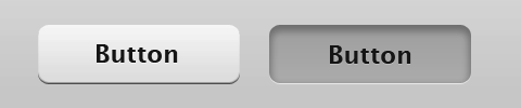
Think of a button. When a button is pressed, most designers tend to make it darker. Why? The reason is simple – we imagine the button as a 3D object. When this object is pressed, we assume it goes further away from us. We may also assume it goes into an opening on the surface of the “device”, and thus is now covered somewhat from a light source.
Using this basic idea we can build the UI metaphor by basing it on 3D objects with depth. Color things you want to appear to be sticking out lighter. Color things that are carved inwards darker. This doesn’t apply to every aesthetic style, but generic things like OS interfaces tend to follow this principle – especially when depicting real world objects like buttons and switches.
2. Color - use heat to manage focus.
Colors don’t all behave the same way. There are those that are considered cold – blue and green shades – and there are those that are warm – red and yellow. Warmer colors expand when placed next to colder colors, they literally spill out and take dominance. Here’s an example:
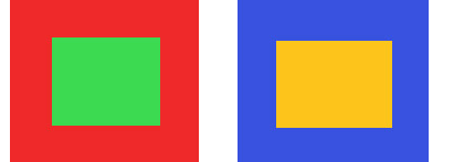
Take a look at the square on the right with the blue and the yellow color segmens. The yellow is warmer and brighter and so it takes prominence on the image.
What about the red and the green? This one is trickier, but the warmer red is taking control here. The colder green contracts inwards, letting the red move forward.
This is very similar to point 1 – warmer colors are brighter. Not only that, they also appear closer to us. Use warmer colors for elements you want to pop out and get noticed. Colors like red are especially good for this purpose, and it’s no surprise that pretty much all the US presidential candidates’ websites had the donation button in bright red.
3. Contrast - attract attention with higher contrast
Higher contrast items stand out – they catch your eye. Look at the following example of a content window with some text, and a button. Here we’re using both, brightness levels and contrast, to manage the user’s attention and focus.
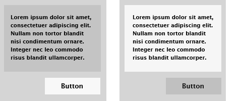
In the first instance, the text is on a darker background, while the button is on a lighter surface than the rest of the pane. The button has the highest contrast between its black text and the light grey surface it sits on. It’s also the lightest element on the surface – it pops out.
On the right I’ve flipped the shades. Here the text pops out because it sits on a lighter background and has a high contrast between the text and the background. The button now fades away.
Use contrast to manage user’s attention. You don’t necessarily need to make buttons lighter (that will depend on your design style and theme), but you do need to make them stand out enough so that they’re not overlooked. Decrease contrast for less important areas of your UI to make them take a back seat.
Example: The OS X interface
Let’s see a real world example of these principles from a well known usability expert – Apple. This is the interface for the OS X operating system’s control panel for the Mac:
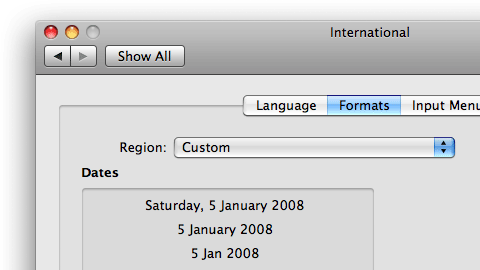
You can see contrast and 3D metaphors at work here. Buttons are light and high contrast, while becoming darker when pressed. Certain content areas are bevelled inwards to group together various items and because they’re less hierarchically important. It looks good and it’s very usable.
Think through your UI design process logically. Are you trying to depict a real life object like a button or a switch? Use shadow and light to create depth and 3D feel appropriately.
Do you need to manage user’s focus, for example give prominence to the welcome message or a notice on your site? Color that box in a warm color like yellow. Ensure that all the important controls have enough contrast to stand out so they’re not overlooked.
I hope you found this useful – please don’t hesitate to post any thoughts or resources in the comments below.