As a followup to my previous post on adding shadows for greater usability, here’s one quick way to implement such shadows using only CSS. Note: I will assume you are fairly familiar with CSS layouts and Photoshop for this tutorial.
The Method
There are different ways of tackling the problem of adding shadows to menus and windows with CSS – this is just my take on it. It’s not the most straightforward task and you may be able to find more elegant solutions by experimenting yourself.
The core thinking behind my method is to add the shadow (a transparent PNG image) as a background to the menu div. We’ll need to slice up the shadow image into separate parts if we want the div to scale.
I’m going to make a fixed width menu (which scales vertically when there are more links), so I’ll split up the shadow into 3 images. If you want the div to scale both horizontally and vertically, you’ll need at least 4 (that’s where it gets much more complex, so I advise going with fixed width unless its really not possible).
Images
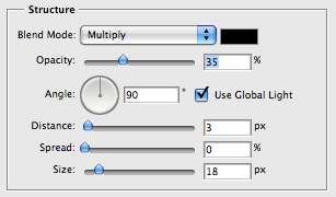
I’m going to cut the shadow into 3 slices. Create the image in Photoshop (or your favorite graphics design tool) which is the same width as the menu you want, then add a drop shadow layer style to it. Settings close to these will give you a nice soft shadow:
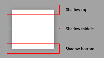
Flatten the image and slice it into three. You want get the whole top of the shadow, spanning the whole width and a little into the menu – this is so you get the whole of the shadow edge, as it has a large curve radius. Also get the bottom and a middle section (just 1 pixel in height would do for the middle as it will be repeated vertically). Note that I am cutting the menu surface itself as well as the shadow.
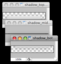
Make sure to save the resulting slices on a transparent background. Here’s the images I cut up (the shadow is fairly difficult to see on those transparency squares, but it’s there):
The Markup
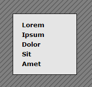
I’m using a pop up menu as an example, so I’ve drafted up some simple markup for this purpose. Obviously your menu would probably be more advanced and functional, but I’m focusing more on the shadow here and not the menu. Here’s the markup:
<div id="menu">
  <ul id="menu_list">
    <li>Lorem</li>
    <li>Ipsum</li>
    <li>Dolor</li>
    <li>Sit</li>
    <li>Amet</li>
  </ul>
  <div id="menu_bottom"></div>
</div>
Pretty standard markup. We’ve got the main menu div, then a nested unordered list with a bunch of list items. Each list item would contain an anchor if this was a real navigation menu. The last item is the “menu_bottom” div. This is needed to display the bottom portion of the shadow – I’ll get to that in a second, but now let’s take a look at the CSS.
The CSS
Here’s the CSS I used to style the markup above with the shadow images I’ve created earlier:
#menu {
  padding-top: 26px;
  background: url(shadow_top.png) no-repeat;
  width: 164px;
}
#menu_list {
  padding: 0 0 6px 0;
  margin: 0;
  list-style: none;
  background: url(shadow_middle.png) repeat-y;
}
#menu_list li {
  padding: 2px 35px;
}
#menu_bottom {
  height: 26px;
  background: url(shadow_bottom.png) no-repeat;
}
Pretty simple. Let’s examine each element in detail:
First, we add a padding to the “menu” div. This padding is the same height as the top shadow image. This padding allows us to apply the shadow as the background so it will show up at the top of the div. Also, we give this div a width the same size as our shadow image width.
Second, we need to style the unordered list. Get rid of any default padding, margins and styles it may have (I’ve added a little padding at the bottom for aesthetics) and apply the middle shadow image as the background with a y-axis repeat.
Third, add a little padding to the list items so they have a little whitespace between them and the edges of the menu div.
Finally we need a way to add the bottom shadow. We’ve used up the “menu” div and the “menu_list” items, which is why I’ve added another div at the bottom called “menu_bottom”. Just give it the same height as the bottom shadow image and set that as the background.
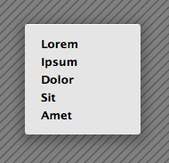
That’s it – all done. The result will look like this:
Legacy Support
But wait! What about IE6 and older browsers? They don’t support alpha transparency so the shadow images will look pretty bad.
No problem – we can add IE6 (or older) specific CSS code to provide an alternative to the PNG shadow images. I’m going to make a set of GIF images for IE6 with a solid 1 pixel border, instead of the soft shadow. To tell IE6 to use those images instead of the PNGs add the following code in the markup head section under the previous CSS code/include:
<!--[if lt IE 7]>
  <style type="text/css" media="screen">
    #menu {
      background: url(shadow_top.gif) no-repeat;
    }
    #menu_list {
      background: url(shadow_middle.gif) repeat-y;
    }
    #menu_bottom {
      background: url(shadow_bottom.gif) no-repeat;
    }
  </style>
<![endif]-->
And yes, you can of course include an IE6 specific stylesheet between those tags instead of the style code directly, which I recommend. This will give us the following results when we view the same page in IE6:
And there you have it. Beautiful shadows implemented with W3C valid markup and CSS, that also degrade gracefully for older browsers. If you like, you can download the source files here.
Have any thoughts about this or a better way you know of to add shadows to menus and windows? Post a comment.