We’re all familiar with the “OK” and “Cancel” buttons you get on dialog boxes. Simple labels that ask us whether we agree or disagree to the next action the application wants to take. The interesting thing is that using exclamations like “OK” and “No” isn’t all that usable. Instead, you should use verbs. Let me illustrate this with an example.
Here’s a save dialog that we get in WordPad on Windows when you make some changes to a document try to quit without saving:
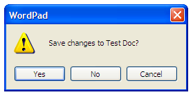
It asks you whether you want to save the changes. At the bottom we get the “Yes”, “No” and “Cancel” buttons. Their function is obvious once you read the dialog message above. On their own however, they mean very little because you need to know what you’re saying “Yes” or “No” to.
Here’s a very similar dialog in Mac OS X. Here I’m using a WordPad equivalent, TextEdit, and again I’m trying to quit without saving the changes to my document:
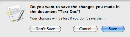
The message is similar to the Windows dialog – though it goes into more detail, explaining what will happen if you decline – but what’s more interesting is the button labels. They’re all verbs – “Don’t Save”, “Cancel” and “Save”. They all mean something even when disconnected from the message above.
How does this affect usability? Well – in the first example, you’d actually have to read the dialog box message before making a decision about which button to press. In the second example, you know what the dialog box is about just by reading the button labels – you don’t even need to read the message above to decide what to do. This not only saves time, but makes each choice clearer – the buttons tell you exactly what’s going to happen.
Now, this is a simple example using Windows and OS X, but this principle applies to all applications and web apps. Just by using verbs instead of exclamations on your buttons or links you’ll save your users time, as well as make all the choices clearer.