Forget the Wireframes, Throw Away Your Boxy Layouts — Design BIG!
Thinking outside the box can make your designs “pop”, and having good ideas can help you become successful — but what if you could not only think outside the box, but play with the box, kick the box, smash the box all over the place.
The secret is to design BIG!
Designing for others is one of the most boring things you can ever do because it is always about what they want, and not what you want — right? Wrong!
We can learn that even if clients ask us to do something, we have total freedom to do whatever we want, with one rule: “Stay inside the box”. The thing to remember is that the actual “box”, or wireframe, can only be in one single shape or form, not your design!

Thinking this way, we can get away from the conventional design and the usual look and feel. We can finally jump into a new design atmosphere, create new things and get that “WOW” that makes us smile.
Below you will find samples and ideas to make your design “pop” even more. I hope to help you to create eye catching layouts with little work. Also, I want to share with you a few tips on how to get the “WOW” we all deserve. After all, sleepless nights have to pay off at some point!
1. The usual look and feel… RUN!
If you agree with me, many online portfolios out there have much of the same old look and feel: boxy, wireframed and boring look. My suggestion is to get away from this usual, tired style. These types of layouts are overdone, and even after Web 2.0 came along we still see a lot of them. Here are a few samples of what I think you should NOT do/follow:
A.

If we take a close look at the image above (A), we notice that it uses a somewhat usual style. There is nothing wrong with this layout. The brand element is on the upper left corner, the “hero” image is inside a banner, we can see a navigation menu on the left side, and everything else happens to just fit in the right place. There is nothing different, nothing new, or nothing that would make you say “wow”.
Take a look at the image below and we can see similar points.
B.

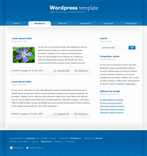
The layout above (B) shows a very similar look and feel to the layout (A) — a simple and straightforward style. Another simple WordPress template: Banner on top, navigation buttons, the left side has the usual heavy content and the right side we have links and so on. Nothing special, right?
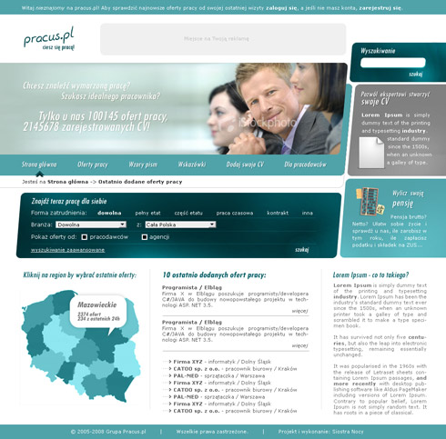
In the next layout we can see a slightly better approach. It uses a better image for the main offer and we can also see some nice curves throughout the whole page — but again, these layouts are overdone. Take a quick look below:
C.

These are just too boring — the same old usual look and feel as most websites out there. The question is, can we do better? Can we get more creative and design stuff that is real eye-candy? Can we do it all in a few samples? Yes, we can! Take a look at the examples below.
2. Freshing up the look - Design BIG!
A.

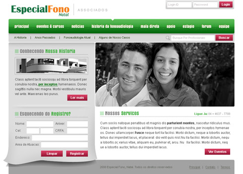
Looking at the above layout (A), it seems like another usual design, but we can see some details, which when added up can make a big difference.
The navigation bar has a lot more room to breathe and adding an indent to the current page adds a little more to the look and feel. Keep the least amount of colors throughout the layout for consistency, unless you are doing some special project — and even then, be careful. Look at the left side, behind the form, instead of using a simple banner, we use an illusion effect, so it seems that a page is floating and moving behind it.
B.

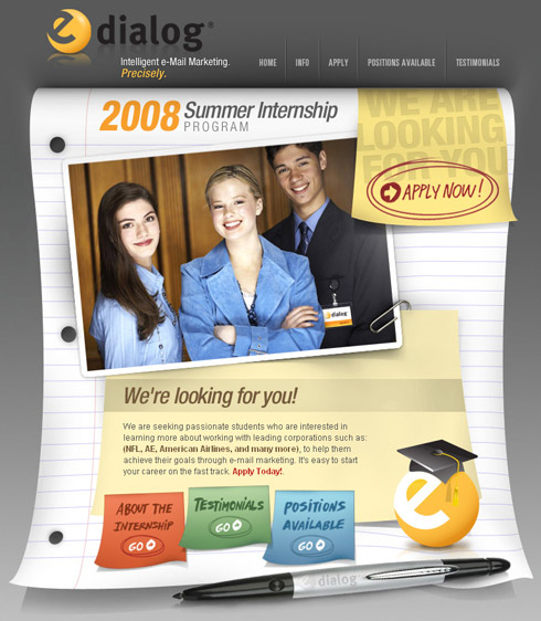
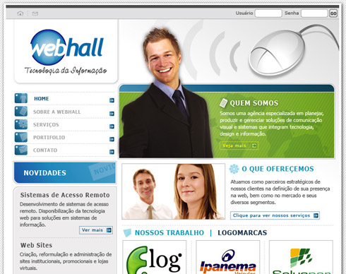
Another great layout can show us how to think different and design BIG. The above layout (B) uses a very different frame than most layouts. There is an actual notebook page used as the frame for the content. It makes your page unique on its own and it can generate the “wow” you want to achieve. Using graphical elements like the pen also adds a lot to the overall look.
C.

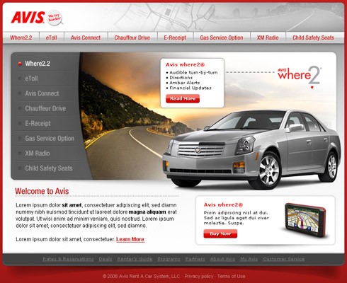
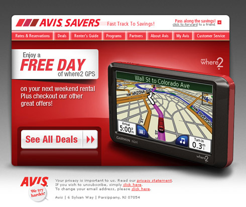
Using the same concept and BIG ideas, here is another layout (C). Notice that the banner runs away from the usual and conventional website layout. The vehicle is outside of the main banner making the the site feel a lot more welcoming.
Same goes to the shadow used behind the “Avis where2″ container. These are small details but they go a long way. It’s always good to remember that your design has to look different from others, and needs to stand out. You can only achieve that if you think aggressively.
D.

There are a few details in the above layout (D) that can make your design “pop”. Here are some of the things I think you should keep in mind:
- Explore the banner in different ways.
- Make your image “pop”, cutting its edges and shifting it a little to the side of the page.
- Watch your margins and let your typography breathe among the columns.
- Instead of laying down a simple white container or box, add some shadow behind it to give it life.
- Use icons — they’ll add a lot to your layout.
E.

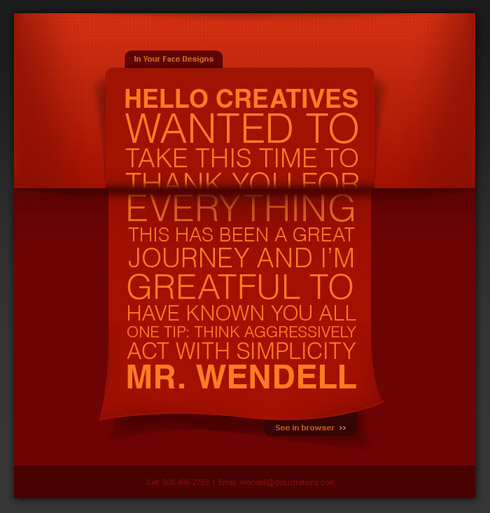
Now, the layout above (E) is a real ”out of the box” idea. This was an actual e-mail design that was sent out to my department when I left the company I worked for. I had enjoyed my time there and wanted to send the team my personal “thanks”; and since that company was an e-mail based company it was a good fit.
Okay, back to some tips. I used a nice curved paper effect, so it gives the idea of an actual post card. The BIG type helps with the “modern” look, and the red shade all over the place, is a warm way of saying “thank you”. Another good way of getting these effects to “pop” is the detailed use of the shadow. Imagine how this would be in real life, and try mimicking it. The results can be amazing.
F.

G.

H.

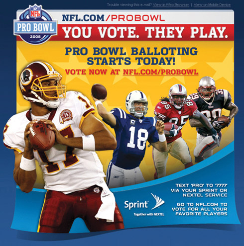
Notice that the player is outside of the box or page, while the email page is somewhat floating. This type of design is a very aggressive approach, and should be experimented and explored fully before delivering to any client, especially when we talk about NFL.
3. To conclude…
Coming up with something unique and interesting is a must. Create nice icons and symbols — these are elements that can add a lot to one single page. Throughout these last few layouts we’ve explored a few different ideas to help you innovate a your designs.
This can be as simple as changing the shadow around, moving lines, and always, watch your pixel margins. Focusing attention on the details doesn’t hurt anybody. Sometimes you can design something that gives the reader an illusion as to something is about to move, or fall off the page, this is not only a way to think “outside of the box” but it is definitely, playing with the box!
Some Tips & Suggestions
- Keep up with the latest updates on design and web news.
This will help you when designing for unusual clients, and you can get your foot in the door by knowing beforehand what is expected.
- Learn as much as possible from your mistakes.
Sometimes you will fail, but if you ignore the opportunity then you wont be able to learn from it.
- Never rate your own work.
That’s right! Always have friends and people you trust around you. Sometimes your best design is not the best approach. It’s always a great idea to have a second opinion.
- Be on time. Watch your promises and pay attention to the deadlines.
People are often falling into this trap. Many designers have amazing artwork, but because they lack time and promises, even with good work in hands, they can be ignored. Come on!
- Be organized.
Life can be stressful at times. We designers cannot lose track of our projects. Being organized will not only help you get things done faster, but it can also help you focus on other details that you could never deal with before. Being organized reflects everything and anything.
2 Oct, 2008
I have personally used and worked with Dellustrations for my company’s website, logo creation, letterhead, business card, email marketing and so much more.
They do an incredible job and it just makes your jaw drop and better yet it’s affordable.
Give it a shot and trust me… you will be surprise on what Wendell and his team can do.
2 Oct, 2008
Dude… awesome job!!
Thanks for the tips!
2 Oct, 2008
Thanks Alan, for the support and impressive words. We try to deliver ALWAYS, high quality work to our users and clients.
Stay tuned!
Newer things will come up live soon.
Wendell
2 Oct, 2008
Good article, but I think the title is somewhat misleading. All of these designs still use a grid which is very obvious. The only difference is that they have…curvy lines on one of the edges, or a large photo that gives the design depth.
Which is all great, but “forget the wireframes” title I find to be sensationalist.
I did enjoy the problem/solution structure of the article though.
2 Oct, 2008
I find the title a bit misleading too. Because at first, I thought you meant “wireframe” as in sketching/planning phase, Where designers draw crude sketches or simple html to convey the design layout.
2 Oct, 2008
Nice article, title misleading, still nice article…
Just one thing puzzled me….
http://www.wsu.edu/~brians/errors/greatful.html
3 Oct, 2008
Awesome article. Much appreciated!
3 Oct, 2008
Great article with some nice examples.
3 Oct, 2008
[...] input with From the Labs: Microsoft Surface + Nintendo Wii Mashup Dmitry Fadeyev reckons we should Forget the Wireframes, Throw Away Your Boxy Layouts — Design BIG! and I love this post on Manage Focus Effectively Using Contrast. It definitely aids in guiding [...]
3 Oct, 2008
[...] today is the Page Curl effect from Veerle’s blog, after being inspired by the article published by Usability Post. It’s a very good effects for web [...]
3 Oct, 2008
I was quite excited when a started reading thinking this was going to be a revelation buuuuut I am sorry to say that I’m a little disappointed.
The first few examples of what not to do were not terrible designs, overused like you said, but pretty good with creative ’standards’.
It’s great in theory to think so far outside the box that it is your play thing, but, when your foundations are ultimately a box it becomes difficult to be so creative.
Personally, I think your designs are great but in no way are they ‘the next step forward’ which everyone is looking for. You have broken the constrains of the box but not by much; and by doing so maybe at the expense of quality and aesthetics?
Thanks for the article.
3 Oct, 2008
Great post, thanks.
So many corporate sites are either dull, or they go too far in the opposite direction and make the whole thing some over-zealous Flash monster. There is a balance to find there.
I decided to do something very fresh for my mortgage site. Mortgages are so dull, and all the sites out there about mortgages are equally dull.
This is just the holding page, but the design style carries on throughout the site (when it launches):
http://www.bestmortgagedeals.co.uk/
3 Oct, 2008
@ Charles, very nice I like it!
this is what I am talking about… thinking more than JUST a layout!
Congrats!
Keep at it!
3 Oct, 2008
[...] - Forget the Wireframes, Throw Away Your Boxy Layouts — Design BIG! The title speaks for itself. A guide to thinking out of the box and designing [...]
4 Oct, 2008
The idea is just great. But the problems are both:
1. People have navigate throw modular and wireframed websites during years. You just can’t change that so radical. You can confuse people that have learned to navigate throw clasis websites.
2. If you think on changing the way you design for companies you must balance a great design with the solid image that a company must show to the public. Don’t be so crazy when designing, think on the public that must interpret your design. If they look a crazy design they will think that the company is crazy too and they won’t trust.
Recently Jquery redesign his website putting a rockstar illustration in his homepage. The feedback was so clear: Public didn’t like that. They though that they don’t want a rockstar, they want a solid product.
This is how publick think and a designer must learn to think like they.
Jquery site redesign post:
http://jquery.com/blog/2008/08.....-redesign/
Community feedback of the redesign
http://jquery.com/blog/2008/08.....ty-speaks/
Death to the rockstar (public won)
http://jquery.com/blog/2008/08.....ock-stars/
Again sorry about my poor english, my first language is Spanish, hope you understand.
5 Oct, 2008
Laren, thanks for the counter point :)
The problem with that Jquery redesign wasn’t that it went with a daring new design — the problem was that the new design was bad (or at least the rockstar heading was). The image was just too crazy for the target audience, and I don’t think it was very good either :)
I’d say something like: http://www.apple.com/macosx/ is still pretty big and product focused — yet it’s executed well and with restraint and so ends up looking good.
5 Oct, 2008
Yeah, designs like Mac OSX Leopard page break the modular design a little but also conserve some classic design.
Apple website is a great example of breaking the “wireframe” without loosing his solid company image.
6 Oct, 2008
[...] at Usability Post, guest writer Wendell Fernandes asks you to design BIG: Thinking outside the box can make your designs “pop”, and having good [...]
7 Oct, 2008
That’s all I’m saying :) Think outside of the box when designing! Nobody is changing EVERYTHING! You are the change! not the design.
8 Oct, 2008
All those designs have one thing in common, they all look like table based, £15, downloadable templates…
10 Oct, 2008
Totally agree with Harry Roberts.
10 Oct, 2008
[...] Forget the Wireframes, Throw Away Your Boxy Layouts — Design BIG!: Kritiikki laatikkomaisia leiskoja kohtaan osui ja upposi. [...]
10 Oct, 2008
Completely underwhelmed. I thought that I might see something new here, but this all looks like the same stuff that’s been done for years.
I mean seriously, the most interesting looking are E and F, and even those still adhere to a box.
Granted, I think that its going to be extremely difficult, if not near impossible, to completely away from the boxy layout. Books are like that. Magazines are like that. Even your monitor is essentially a box.
14 Oct, 2008
Mattz, i’m sorry you’ve missed the point.
OBVIOUSLY everything is still in a box - THAT’s nothing new. All We are saying is that you can get away from boxy layout as much as possible. make things float, design outside of the conventional structure.
17 Oct, 2008
I personally dislike any shadow except a regular dropshadow. I would advise against the curved shadows or angled ones in designs. Since the object with the shadow isn’t at an angle or curved, it makes the background of your site look curved, as if it’s sitting on warped plastic. That in turn makes the site look unstable and weird. It’s physically unsettling and regular drop shadows can achieve the same type of “pop” without the disorientation.
22 Oct, 2008
А что, неплохо!
10 Nov, 2008
I agree with the whole “go big” idea. I’ve been toying with it this past year, but have been afraid to really let myself go until now. I am currently working on a new version of my site that finally looks like how it should have looked in the beginning. Lots of space for breathing, a nice, attractive illustration, but only in the header, large text on the important things, etc.
This entry only helped me further.