Earlier this month I’ve received news of a new UI patterns library called Quince, which is a tool that I think you may find useful. The app is basically an organized collection of various interface patterns. Each pattern is part of a ‘problem’, and several examples are usually provided as viable solutions. Each of these problems is also accompanied by a bit of text describing the solutions and providing tips on things like accessibility.
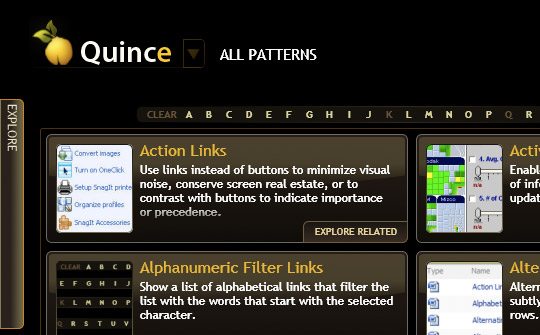
There are also various ways of browsing the patterns. You could just search for what you want or browse all the patterns alphabetically. You can also browse by common user tasks, such as “data entry” or “form”. Here’s a general alphabetic view:

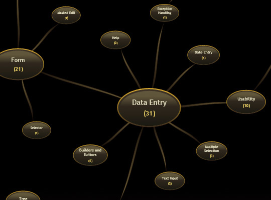
You can also browse by something called “tag relations” which shows an interesting mindmap-like chart:

Finally, you can browse by ‘Wireframe’, which is a little confusing at first but basically what it does is organize the different patterns by the location you would expect to see them in on an actual interface. Here’s what that looks like:

What do I think? I think it’s a very good idea and the developers of the app have good intentions but unfortunately the implementation is way over the top. Most of the app is done using Silverlight and has too many animated transitions. Everything is very glossy and screams for attention. I think for this sort of thing you really want a minimalist UI – you want to shift the focus on the content – the patterns you’re trying to show – not the actual app itself. As it is, all the effects, transitions and eye candy get in the way of me actually using this thing and getting to the content.
What do you think?