![]() Safari 4 beta has been public for just over a month, and now that I’ve had the chance to try it out for some time I’m going to share few thoughts on the things I like/dislike about it, and whether I think it’s better than Firefox. Note: my choice of OS is OS X on the Mac, so the following is a review of Safari on that platform.
Safari 4 beta has been public for just over a month, and now that I’ve had the chance to try it out for some time I’m going to share few thoughts on the things I like/dislike about it, and whether I think it’s better than Firefox. Note: my choice of OS is OS X on the Mac, so the following is a review of Safari on that platform.
The tabs
There’s been a lot of talk about the new tabs in Safari 4. The new tabs have moved to the top of the browser, taking place where the title bar would have been (the title bar being no more). Here’s what they look like:

I have a problem with the new tabs. No, it’s not that they’re on top that’s bothering me. Actually, having them on top makes a lot of sense and reinforces the “tab” metaphor (that’s where you’d expect tabs on a real folder). What bothers me is that unlike Chrome, Safari has no title bar. Because it has no title bar, the tabs are now the title bar. Yes, it saves space, but it also means the tabs must be full width, or the UI doesn’t work.
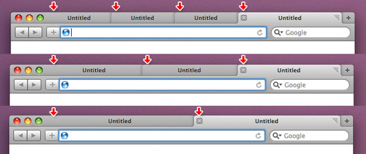
This means that whenever tabs open or close, they all resize themselves. So imagine you have a bunch of tabs open and you want to close a few on the right. On old Safari, the tabs stay a consistent size unless there are a lot of them. Now… whenever I close a tab, all the other ones resize their width (to ensure their fill the whole width of the ‘title bar’), which means the close button on the rest of them moves to different locations. I can’t quickly close a few tabs because I must actually aim for the new close button as it moves around every time I close a tab.
Here’s what I mean. I’ve added some arrows to show the locations of close buttons on varying amounts of tabs:

It’s also annoying having to travel half across the browser to select a tab if you’ve only got two open. In the old mode the two tabs would sit compactly side by side on the left.
Another change is to the draggability of the tabs – the ability to drag them around to rearrange them or pull them out into their own windows. The whole tab used to be draggable, but now you can only do so from the little edge in the right corner. I don’t need to drag tabs around too often, but when I do this is definitely harder to do than before. I would have preferred the way Google has done it with Chrome: keep a consistent title bar “area”, which allows for fully draggable tabs as well as consistent tab sizes.
Top sites
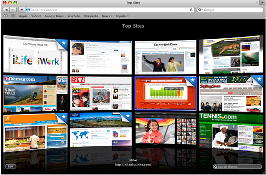
I have mixed feelings about this. On one hand I really like it. It looks fantastic and feels really good when you click on sites (they zoom in smoothly to take up the whole screen). On the other hand, I’m one of those people who uses a blank page when the browser or new tab opens – there’s something nice about opening a blank page; it’s sort of a blank state which then goes to your desired destination.
This is actually one of the reasons Mozilla is going towards a lighter approach with their own implementation of Quick Dial/Top Sites in future versions of Firefox. It’s called the Cognitive Shield, and it’s basically a white page with a ring of little icons that blocks the quick dial page. Functionality is still being debated, so the little icons may end up being links themselves:

Compared this light ring with the Safari top sites view:

It looks great, but for daily use it feels like too much. Back to the blank page…
History search and Cover Flow
The ability to search your history and the Cover Flow presentation are nice additions I think. I must admit that I haven’t really used the search history feature very much as I prefer to navigate history through the menubar drop-downs; and even that I don’t use very often. Cover Flow does seem to make sense when used in this context though, and looks very attractive.
Address bar changes
The address bar has undergone a couple of changes. Gone is the loading indicator behind the bar (the whole address bar was used as a progress bar) which is replaced with the loading wheel. Not great, considering now you don’t know how much of the page has loaded – that one was of the cool features of Safari.
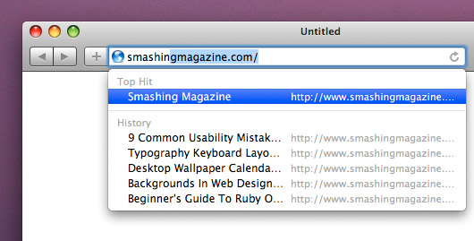
Another change is how Safari shows site suggestions as you type. The main item is now the title of the page, rather than its web address:

This does make sense, but for some reason I can’t get used to it. Perhaps I’m too used to looking at URLs. It does show the URL as well, but that’s a secondary item and is placed on the right as well as truncated, which means half of the address gets cut off, making it useless. I prefer the way Firefox does it with the URL under the page title, which gives it enough space to show fully.
Safari or Firefox?
I’ve been using both Safari 4 and Firefox 3.1 betas for a few weeks now. It’s very difficult to make a choice between these two because the feature sets are almost the same, and yet where one has an advantage over the other it inevitably also comes with a downside.
For example, the main strength of Firefox are the plugins and add-ons available for it. Plugins like Firebug, Screengrab, Adblock and Xmarks (previously known as Foxmarks, which is now available for Safari as well) are genuinely useful. There’s plugins which let me lock certain tabs (like Gmail or Google Calendar) to make sure I don’t accidently close them – something like that isn’t available for Safari as far as I know.
On the other hand, Firefox is slower than Safari on OS X. The startup time is much longer and memory consumption larger. Because a lot of the features are done through the community (plugins), the whole UI is also still messy in places – e.g. things like this need a lot more work:
![]()
That’s the Screengrab button/icon in the status bar. Why is it so ugly? There should be some guidelines plugin developers need to follow if they want to create little icons for the status bar. Is this even a good place for it?
Additionally, Firefox renders OS X interface elements badly. Take a look at these button comparisons to see how crisper the Safari’s versions look:

Sure, these are small things, but when you use something a few hours every day you tend to notice them.
Conclusion
I’ve mentioned some things I dislike about the new Safari. Is there stuff it gets right? Of course there is. Safari gets a lot of things right, which makes it a really great browser. It’s fast. It loads fast. It renders pages very well. I really like the inline address auto-completion, which allows me to start typing the address of a page and it would complete the rest for me – all I have to do is hit enter to go there – e.g. type “usa” for “usabilitypost.com” and hit Enter. There is of course a plugin for Firefox that does this as well, although its functionality doesn’t extend to addresses with full stops in them, so if I type “news.y” it won’t go to “news.ycombinator.com”.
I also love the ‘Merge All Windows’ feature, which for some reason doesn’t come with a default shortcut. I’ve set it to Control + M. What it does is merge all windows that may be floating around into one window with them as tabs. Very useful for collecting stuff when sites decide to open additional windows instead of tabs.
In the end, I think prefer Safari to Firefox, at least on OS X – though it’s very, very close, and I’m making sacrifices whichever browser I pick. The UI in Safari is clean and coherent. It feels like it’s part of OS X – it feels integrated and fast. The interface inconsistencies and lack of polish in certain places make Firefox feel like a third party app, and when you have two programs like that, the one that’s more at home ends up more satisfying to use. Firefox has come a long way; the interface in Firefox 3 looks and feels much more Mac-like – but it’s just not quite there yet.
On the other hand, Safari 4 is still in beta – and it shows. Some sites crash (UX Booth comes to mind, which for some bizarre reason kept crashing; I think they fixed it now though), and more annoyingly, some behavior in web apps is wrong. For example, I’m writing this post in Firefox because the modal windows in Wordpress don’t work correctly: they block all access to the page, including the modal window itself so you can’t even close it. It’s frustrating to see such advanced browsers tripping over small issues, but the things they do get right are really great, which only makes me really look forward to seeing these issues worked out.
What browser do you prefer and why? Share your comments below!