CSS frameworks have become quite popular over the past couple of years. Some of them try to fit in everything: a grid system, a style reset, basic typography, form styles, you name it. Others focus solely on the grid, but still end up a bit bloated.
With added complexity comes… well, complexity: a steeper learning curve, increased development time, and – cringe – tougher debugging.
Here is a fresh take on the CSS grid (loosely based on Nathan Smith’s 960 Grid System). Its mission is to be lightweight. And, as I’ll show in part 2, it can be used to streamline page templates for content management. All this in just one measly kilobyte (actually, 662 bytes, but who’s counting).
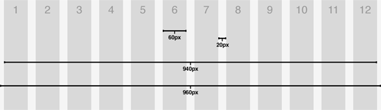
12 Columns, 960 pixels
The basic configuration is a 12 column grid system spread out over 960 pixels. Each column is 60 pixels wide with a 20 pixel gutter in between. While this is what I typically use in my designs, you could easily apply the same technique to other widths and other numbers of columns.
The CSS
Lets jump right in an have a look at the CSS. As you would expect, there is a class that corresponds to each of the possible column widths, units 1 through 12. We mentioned that each column is 60 pixels with a 20 pixel gutter between each column. Thus ‘.grid_2’ is calculated as 60 + 20 + 60 = 140 pixels.
In addition to the column widths, there are only two other classes defined: ‘column’ and ‘row’. The column class has a margin of 10 pixels applied to both the left and right edges, resulting in a cumulative 20 pixel gutter. Also note the ‘overflow: hidden’ attribute applied to both column and row. The real purpose of this technique is to clear floats, circumventing the need for a ‘clear: both’ declaration. Finally, we need to set the ‘display: inline’ property on ‘.column’ to prevent the double-margin bug in IE6.
.grid_1 { width:60px; }
.grid_2 { width:140px; }
.grid_3 { width:220px; }
.grid_4 { width:300px; }
.grid_5 { width:380px; }
.grid_6 { width:460px; }
.grid_7 { width:540px; }
.grid_8 { width:620px; }
.grid_9 { width:700px; }
.grid_10 { width:780px; }
.grid_11 { width:860px; }
.grid_12 { width:940px; }

.column {
  float: left;
  margin: 0 10px;
  overflow: hidden;
  display: inline;
}
.row {
  width: 960px;
  margin: 0 auto;
  overflow: hidden;
}
The HTML
The HTML is as minimal as the CSS. Each column contains a class indicating its width. Columns are then contained by a row, which serves to clear the floating columns (and is also instrumental in page templating, to be discussed in part 2). The only thing to remember is that the unit of columns inside a row must always add up to 12 (it is a 12 column grid, after all).
<div class="row">
  <div class="column grid_4"> </div>
  <div class="column grid_4"> </div>
  <div class="column grid_4"> </div>
</div>

<div class="row">
  <div class="column grid_8"> </div>
  <div class="column grid_4"> </div>
</div>

<div class="row">
  <div class="column grid_2"> </div>
  <div class="column grid_4"> </div>
  <div class="column grid_3"> </div>
  <div class="column grid_3"> </div>
</div>
Take it for a spin
That wasn’t so painful, now was it? Beats going to the dentist, at least. Take a look at what we’ve accomplished so far. Then, download the demo and get cracking!
Tune in for part 2 and discover how to use the grid to streamline your page templates for content management.
UPDATE (2009.06.06): Read part 2 here.