Last month I wrote a post about needless website redesigns. The two things I’ve highlighted as the causes were: overuse of latest trends and too many visuals created for their own sake.
Here’s a quick test you can do on a web design to see whether it may have these problems: take the content out and see what’s left. This will expose all the interface “chrome” as it were–the interface that lives outside of content rather than being derived from content. Here are a couple, somewhat extreme, examples.
First, let’s see a site with virtually no chrome: Mark Boulton’s blog:
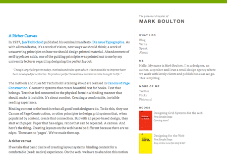
If we take away the content, all that remains is a green line at the top of the page:

This is a content centric design, which takes form by styling and spacing the content itself. Take away the content, and there’s nothing left. As a result, this sort of design will last for a long time and is very easy to adapt and evolve.
On the other hand we’ve got something like Webdesigner Depot:

Lets take away the content and see what’s left:

Now…you could argue that what’s left is just a header graphic and that essentially the rest is gone. It’s true, the rest of WDD is fairly content centric, however, the heavy graphic at the top does lock the design in place. For example, what if you wanted to change the logo and move it to the left? You can’t, there’s some computers there. What if you wanted to add navigation at the top? Tricky. What if you wanted to do any other updates in the header or change the background color of the page? Difficult. The header visuals lock the design in place–not a great position to be in if you want to change things later on.
By the way, I’m not saying that one approach is necessarily better than the other. I am saying that the content centric approach is better at creating a site that will last longer and is easier to maintain. There are plenty of reasons to go with the visually heavy look, for example, sites that rely on this look to fulfill their purpose–things like marketing sites, games sites, artists’ sites. Other sites benefit from the content centric approach, sites where content is king–newspapers, blogs, forums–and in those cases, the extra chrome won’t help.
The choice is yours to make but if you go for the content centric look this test will help you stay on track. Note that this approach isn’t necessarily simpler or cleaner–it’s just an approach that creates the interface through the use of its content, and so eliminates external chrome that exists even when the content isn’t there. If there is a lot of content, the site will still look busy, but at least it won’t be burdened or locked in place by the external interface.