A few weeks ago Jin Yang got in touch with me regarding potential UX Exchange design work. UX Exchange is a Q&A site in the Stack Exchange (SE) family of websites, the most famous of which you probably know: Stack Overflow. Every SE site has its own look and feel, and as the UX site is getting close to graduating from beta, a new design was in order.
If you haven’t been there already, I recommend you head over to UX.SE and check out the community–there’s a lot of interesting discussions about user experience and user interface design, and of course if you’ve got questions, this is the place to post them.
My task was to create a couple of Photoshop mockups for the design, which would then be sliced and coded into the SE template files. As I’ve pointed out before, the tools influence the outcome, so starting from Photoshop already predisposes the layout towards a more visual style since Photoshop is all about working with pixels. Because of this, to maintain balance I deliberately avoided focusing too much on the graphics, and rather tried to think about how the design should work–i.e. which elements should be emphasized the most, which elements should be out of the way, how the visual hierarchy is going to work etc., rather than jumping in and styling the pixels.
If you take a look at the original SE website, Stack Overflow, you’ll see a very spartan design, one that focuses on function over aesthetics. SE sites are generally quite busy looking because of all the different pieces of content shown at once, but the layout arranges and styles that content in a way that helps you scan and find the things you’re looking for efficiently. So while I realize there is a clear need to give the site a unique feel and branding, I didn’t want to stroll too far away from that original design that works so well. That’s not to say I didn’t strive for good looks, rather that I aimed to achieve good looks through simplicity instead of eye candy.
So here’s the couple of mockups I created. This is taken from the Photoshop mockups and is not the final HTML version, which naturally is a little different, but I just want to show you what I worked with.
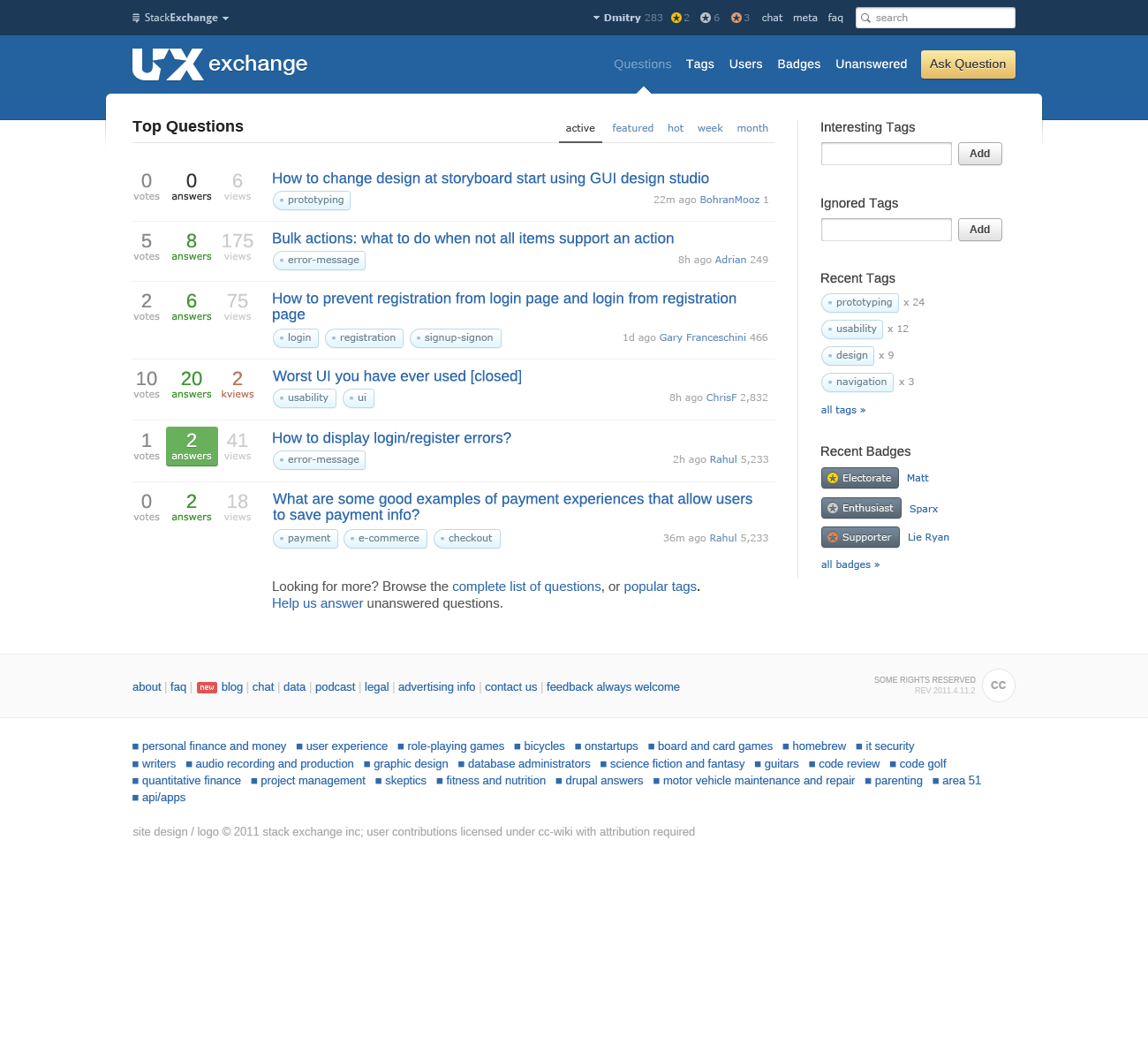
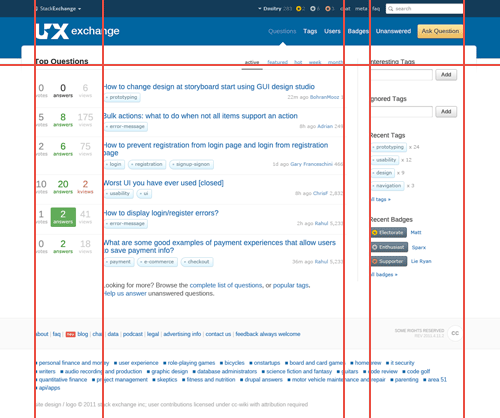
The home page (click for full view):
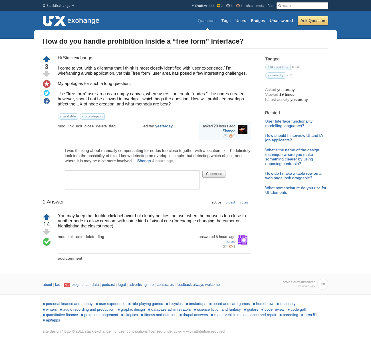
The question page (click for full view):
Here are some of the design decisions I’ve made while working on the design.
What does UX look like?
The first problem was that UX doesn’t really have a “theme”. UX is something that only exists in relation to something else. So rather than trying to embody UX, I thought it best to simply design a good, usable layout. It’s unique look would then define the site.
Dropping the container frame
A lot of SE designs have a frame around the content. Sometimes the content area is a different background to the rest of the page, further emphasizing the main content container. The problem with the frame though is that it squeezes the margins between content, as the left and right columns (content and sidebar) have to be a specific width, and the total width should be kept to a minimum at around 1000px.
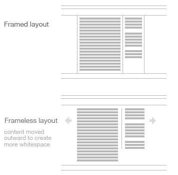
Dropping the frame allowed me to max out the whitespace between the main content and the sidebar. This simplifies the layout by strengthening the visual groupings of the two areas. Another reason, though this is less important in this case, is my personal preference for frameless designs, which I feel look simpler and are more logical, but this is more a personal preference.
Defining the container
With the container frame gone the dimensions of the container were no longer defined. Content sort of floats in the middle of the page. It’s not bad, but I decided to give it a little bit more structure by defining its dimensions using the header area.
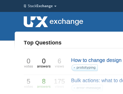
What I’ve done is carve out a slice off the blue header bar. This creates the illusion of the content area being a while page overlaid over the top of the header. A pixel thin subtle shadow going down the sides strengthens this illusion some more. While not a replacement to the frame, this technique provides a little more definition to the main content area.
Navigation
There are a couple of navigation bars at the top: one for the SE network and account stuff, and one for site navigation itself. The SE bar is thinner, and sits at the very top, with the other bar underneath–both of these bars forming the header area of the site. To choose a size for the two bars, I picked a comfortable size for the SE bar and then used the golden ratio to calculate the size of the bar below. This sets a pleasant ratio between the two bar heights.
There are many ways to style the current page indicator navigation bars, but again, to keep things simple I wanted something subtle. I went with a little arrow at the bottom that flows into the content below, giving a clear indication of what page is currently selected

Because it’s a new community, it’s important to get people to ask questions and participate. For this reason the “Add Question” button needed its own styling to stand and attract the eye. Yellow is the brightest of colors, which also works well with blue, so I picked that to ensure new visitors are drawn to it.
Sidebar separator
There are a few options for separating a sidebar from content. The simplest option is simply to leave some whitespace between the two bits of content, which is how it is on Stack Overflow. Another option would be to draw a border between the two containers. Yet another would be to encase the sidebar in a box.
I first leaned towards encasing the sidebar in its own box, similar to that used for the sidebar on this blog. The problem with that was that because the rest of the page has little styling, the box attracted the attention of the eye, almost making the sidebar more important looking than the content. To regain the proper hierarchy I simplified the divider to just a thin gray line on the left side of the sidebar. Also, because there is no content frame the border helps hold the sidebar in place.
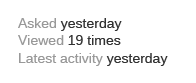
Sidebar question info
On the individual question pages there’s a bunch of information about the question in the sidebar: date when asked, how many times viewed and when the last response was. Each item sits under its own heading. This felt wrong to me because there’s only one piece of information displayed under each heading. Here’s what it looks like on Stack Overflow:
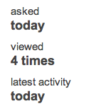
My solution was to put each bit of information on its own line, and give the label a light gray shade to fade it away a little. This compacts the information by removing the need for individual headings. It also makes the content easy to scan because all the information is now contained on the right of each line. Here’s a shot:
Footer separation
SE has four items in the footer: current site links, SE sites links, the Creative Commons license badge and the copyright text. Sitting all together these items have little separating them, so they tend to blur together. I wanted to give this area a little more structure and much clearer separation.
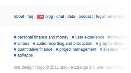
What I’ve done is create a bar for two of the bits of content, and let the two others sit below. So I’ve placed the site links and the CC badge (aligned right) in its own light grey bar, and the SE site links and copyright text went underneath. This split things up nicely and helps each bit of content stand out on its own.
Font selection
Legibility is most important to me in font selection, since a good looking font is absolutely no good if it makes the content difficult to read. In terms of style I decided to go for a sans serif as the main font because UX is a modern field, and so the font should reflect that. Serif fonts are not necessarily “old”, but they have a longer history, which carries with it its own associations.
I originally wanted to use Arimo by Steve Matteson (as shown in the shots), a font created for Google’s upcoming Chrome OS, and designed specifically for the screen. There were some issues with the rendering of the font on Windows, so we’ve reverted to the more proven font stack: Helvetica Neue/Arial
The Helvetica Neue/Arial stack is very legible and clean. This font stack puts Helvetica Neue first, followed by Arial because Windows doesn’t come with Helvetica Neue by default, and OS X comes with both, Helvetica Neue and Arial. Helvetica Neue is a little nicer than Arial so we can serve it to OS X users instead of Arial, but practically the two fonts are the same. For font sizes 11px (e.g. tag labels) I went with Verdana due to its legibility at such small sizes.
Alignment
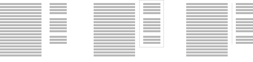
One thing that can lift a design up is thoughtful alignment. Rather than place items where you like, look at the other items surrounding them–can this new item be aligned by something? You’ll find that most things can, and so they should. Good alignment gives the design a strong feeling of order and helps guide the eyes across the various bits of content. Here are a few of the key guide lines I’ve used to neatly line up the content:
Logo
 One of the more difficult parts of the design was the logo. I wanted to add some sort of symbolism to show what UX is about. I didn’t want to focus on the tools, but rather the goal. The final logo is a combination of the two letters “UX” with a star in the middle created using negative space. The star signifies excellence, which is what the field of UX strives to achieve in product design.
See the live version
Head over to UX.SE now to see the live version and check out the current questions and discussions while you’re there. It looks like it will grow into a great site for all things UX.