Today Microsoft posted a blog entry showcasing the new Windows Explorer interface. Long story short, the new Windows Explorer UI in Windows 8 will be based around the ribbon. Here’s what it looks like:

Self-parody?
I’ve been reading people’s comments on this and it’s not surprising that there’s already some backlash against the new design. I can’t blame them, the first impressions are: it’s heavy and noisy. One blog even goes to say that Microsoft have entered the realm of self-parody.
In that post Seldo raises a couple of interesting points against Microsoft’s design decisions, which I’d like to address now.
1) Microsoft’s own usage screenshot shows data for only half the UI elements. Seldo concludes that this shows that half the elements on the ribbon aren’t going to be used at all.

This isn’t true, given that some of these elements weren’t available on the previous UI, which means there’s no data yet on their usage. It’s a new design, so the usage percentage of all of those buttons will change. The current percentages shown were used as a guide to select the set of buttons on the new ribbon, where they are placed and how large they should be.
2) More important, Seldo points out that menu bar usage is less than 5% on Microsoft’s own research, whereas context menu usage is at around 55%.
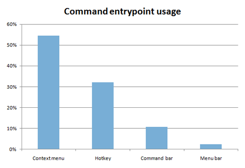
But again, I’m not sure that this says that the context menu is better–it may very well be that the menu bar is so bad that people are forced to use the context menu. Microsoft’s ribbon is their attempt at turning the context menu into something more open and usable by exposing more of those features infront of the user on the menu bar.
A utilitarian approach
I don’t know I like this UI yet or not, but what I do like is that Microsoft doesn’t seem to care about what their competitors, e.g. Apple, are doing. They’ve got their own research, their own ideas and their own views on how their UI should be implemented. They’re not cloning their competitors or what’s been done before, but going in a direction they’ve set for themselves. Apple users may laugh at this new UI thinking it’s a cluttered mess, but at the end of the day this is a different approach to solving the same problem–it’s a utilitarian UI that doesn’t care much about minimalism.
My computer of choice is a Mac, and I doubt I’ll be switching to Windows any time soon (I rely on the Unix foundation of OS X, among other things), but I like how Microsoft are moving their interface in a direction driven by researched and tested design decisions, a direction different to that of Apple who ruthlessly cut and simplify. Simple, clean minimalism is often beautiful, but it’s not a panacea for effective design. We’ll have to wait and see how the new UI works in Windows 8 but I certainly wouldn’t dismiss it outright for being bulky–it might very well end up working well for many Windows users.