Microsoft have just released a developer preview of Windows 8. Here’s an opening keynote video where the new OS is introduced. I’ve tried the developer preview and was left with some mixed feelings.
The good
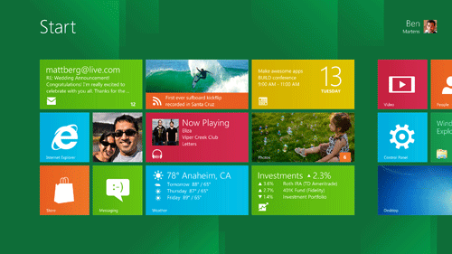
One of the striking things about Windows 8 is the design direction Microsoft are taking with the new Metro UI. Metro UI is purpose built for touch interfaces. If you could only use one word to describe it it would have to be: “tiles”. The UI is built around large tiles instead of traditional icons. The advantage of tiles is the large click area, but also the ability to display additional information inside each tile, like the latest RSS feed item on the RSS reader tile, or the next appointment on the calendar one. Here’s what the start screen looks like (you can jump here any time by hitting the Windows key):
Another element of the Metro UI is the Swiss minimalist style, based around simple typography and layout. No skeuomorphs here, the UI looks and feels like it’s at home on a digital display. This is in contrast to the direction Apple are taking with their realistic looking apps–e.g. a calendar app that looks like an actual calendar with realistic paper textures and tiny ripped pieces of paper at the top, etc.
My heart goes to Microsoft because I feel the sort of design they went for with Metro is honest–honest in the sense that instead of trying to emulate something else, the design embodies the content and the media it lives on. This sort of design doesn’t look like anything else–Metro UI looks like Metro UI. On the other hand, I think many people will prefer the familiarity of Apple’s UI. That sort of UI also provides plenty of eye candy opportunities which help make the product more appealing.
The bad
But…design is choice. What Microsoft are doing right now is effectively avoiding making the difficult choice between the old desktop environment and the new Metro style built for touch devices. The “old” desktop Aero styled interface is now simply an “app” inside the system. Want to enter the desktop? Click on the desktop tile and you’re there. Hit the Windows key or push the Start button and you’re back in Metro. Some apps that don’t have a Metro interface take you directly back to the old desktop when you open it.
Microsoft have essentially created a beautiful new interface for the tablet, but then simply pushed all the old stuff in there too, almost as an afterthought. I’m sure it wasn’t an afterthought, but this is the impression I get when I use the system. The choice is not necessarily one or the other–a new design could be built–but what Microsoft are doing is putting both worlds together into one, and trying to blend the experience, and I don’t think this is working out well because each one isn’t simply complementary, but tries to solve the same problem in a different way.
Each interface was purpose built for different scenarios. The old desktop UI has evolved over many years and is built for mouse and keyboard. The new Metro UI works within the constraints of small screen sizes and touch based input. The two interfaces are inherently different, and tying them together makes little sense because the use case would be one or the other–i.e. you’re either going to use Windows on a desktop/laptop PC, or you’re going to use it on a tablet device. Metro is not ideal for mouse and keyboard, and the old desktop interface is unsuited for touch.
By bringing the two interfaces together Microsoft want to make Windows easier to maintain, since all types of devices will be running the same OS, and they want to get as many developers as possible making apps for their new OS, since again, the OS will now cover an even bigger range of devices. This is a different direction to that of Apple, who have understood the two separate use cases and so split their OS in two: Mac OS X for their desktop/laptop machines and iOS for their touch devices.
Apple’s strategy has turned out to be a success, both in user experience for the customer and profits for the company. I’m very skeptical about Microsoft’s direction. By wanting to have it all both ways, they’ve avoided making the difficult choice. This will lead to a fragmented and uncertain experience for the end user, since only one of the two worlds would really be at home in any one use case, unless the user is isolated into either the desktop or the Metro UI. While I like the look and feel of Metro, I think this interface really will only feel at home on a tablet computer, not a desktop controlled with keyboard and mouse.
I think a better strategy would have been to update the internals in sync but split the two interfaces for the two types of device: evolve Aero on the desktop, and work on Metro on the tablet. This would fragment the “app store”, but in doing so would also force developers to create apps suited for each device. It would also ensure the experience is never compromised on either.
What do you think? Have you tried the developer preview yet, and if so, how did you like it? Post a comment below.