Recently, I bought an iPod Touch to learn about the mobile web experience. I used it for, amongst other things, managing my website and accessing Facebook.
Along the way, I discovered two usability issues that designers should be aware of, to minimize their interference with the user experience.
Textarea “Blocks” Mobile Scrolling
The subhead here tells almost the whole truth: don’t give users reason to scroll within the iPhone UI element known as a textarea.
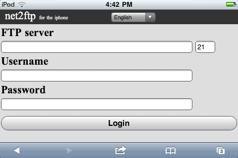
DreamHost uses the user-friendly web FTP script “net2ftp” to allow its customers to manage their sites from their browsers, without relying on FTP clients. While that’s broadly good news, net2ftp relies on textareas for its critically important “Edit File” function.
So, if you select a file and click “Edit,” while on your iPod, hope that you only need to edit text above the fold. Below that, and it appears at first try that you can’t access the text for lack of scrolling ability!
You might say, “So what? How many people are actually using FTP from their mobile devices?” Granted, that’s not the most common use of mobile devices… but net2ftp found enough demand for it to create a mobile version of their software. Note the words “for the iphone [sic]” besides the logo:
A better objection would be: “It just takes a second finger to scroll textareas on mobile Safari.”

True… but little known. The result is that many users will give up in frustration, thinking they can’t scroll. This issue affects many websites. Facebook’s private messages also rely on textareas:
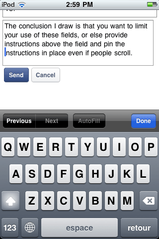
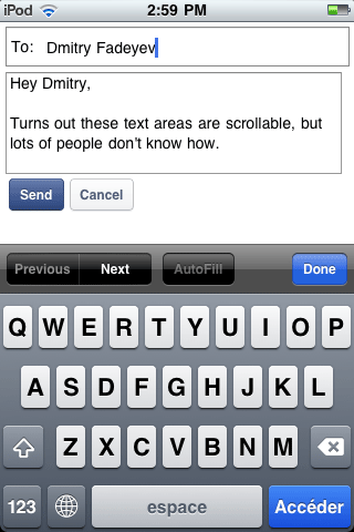
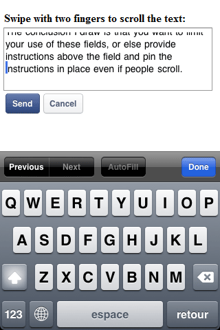
For now, the simplest way to solve the problem is to provide instructions above the fields on how to scroll. Then, keep the instructions visible even if a user scrolls down, like so:
Pinch-and-Zoom Means Click-and-Whoops</h3>
When managing my site, I had to use the “pinch-and-zoom” functionality of the iPod to see what I was doing on the login screen.
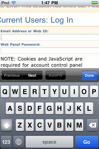
Western reading habits have me scanning left to right, then top to bottom, and thus I expect the conversion button to be in the bottom or bottom right. And I’m in good company, as best practice guides for e-commerce detail pages typically suggest placing the Add to Cart button in the lower right above the fold.
So after filling in the fields, I slid the screen over (still zoomed in, recall) to the bottom right.
In this case, the screen layout did place a button there… just not the one I needed. While hurrying, I only scanned its text, which reads “Signup,” and inadvertently clicked on it. I thought it was a funny label, but then so is “submit” when you’re trying to contact someone, and that doesn’t prevent loads of people from using the text “submit” on their contact form buttons.
In fairness to DreamHost, the page looks fine and works fine on a full-size screen.

Similarly, someone reading before zooming - even on an iPod - would get what to do. And had I paused to think why a login button would read signup (besides for the explanation that we humans aren’t perfect), I might have thought twice before clicking.
The catch is that websites aren’t books, and people don’t read online, they rush. And as is well known - you’re not supposed to make people think, online.
So it’s likely that this is not a commonly made error… but it’s also likely I’m not the only one who will make it. And that for learning purposes, other websites will have dramatically worse implementations than DreamHost, meaning that errors are likely to be more frequent.
In sum, for the best mobile user experience possible:
A. Create a mobile version, like net2ftp. Their login screen, for example, cuts things to basics and is eminently user-friendly. Don’t depend on users zooming in, both because it’s annoying and because it can lead to user error.
B. Limit use of textareas or instruct users about the double finger scroll. It currently is a power-user function, like all those accented characters that require funny button combinations in MS Word.
You need to cater to the lowest common denominator, and most people don’t know that you can scroll textareas on mobile. (Proof of this is content farms writing posts to explain how to scroll them. Such posts are pointless if people know the answer / aren’t searching for an answer.)