Book review
The Language of Things by Deyan Sudjic
 Sudjic opens the book with an anecdote about his experience purchasing a MacBook at Heathrow Airport. It was an impulse purchase and the author desrcribes in detail how Apple was able to utilize design to make the product enticing, an almost irresistable buy.
All of the individual details of the product–its color, its shape, its packaging–carried some sort of message about it. For Sudjic, the combination of these messages generated the desire to own the item, and so the purchase decision was made.
What this book is about is exactly that: how design is more than just about what the product looks like or how it works. It also carries subtle–and not so subtle–messages about the product, or about the person who owns the product. Here are some of my highlights from the book.
Beyond the visual
Design is often associated with how things look, but even this surface level aesthetic element isn’t bound to the visual as there are other senses that can be used, like hearing, smell and touch. For example, pretty much every cellphone these days has a camera. When taking photos, the camera will make a shutter noise. The mechanical event doesn’t actually happen, the camera simply simulates the sound, and it does that to create a richer experience, not just to let the person know a photo was taken–after all any sound can be used, but the shutter sound is used to link the product to its mechanical ancestor. In the same way, materials can shape the experience. For example, Sudjic writes that “The smell of leather or wood or ink transforms our responses to a car or an interior or a book fresh from the printer”. The most successful designs conciously make use of these other senses to guide and refine the experience.
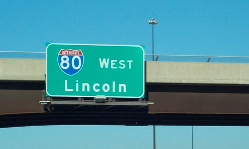
Design can be used to communicate the character of an object, whether that be a car or a typeface. About typefaces, Sudjic writes: “The fact that it’s called a ‘face’ at all is certainly not a coincidence. Type is fully capable of showing the character and personality of the human face. Compare for a moment the message that using Helvetica rather than Gothic for a newspaper headline conveyts, and the subtle variations between these two extremes. In the shape and form of a letter we have all the characteristics of an accent.” For example, the Interstate typeface designed for legibility at high speeds and bad weahter on American highways has a distinct feel to it. When you see it, you know you’re on a freeway, and you know you’re in America.
Designing the timeless
Dieter Rams, the man behind the the design of the many iconic Braun products, from radios to shavers, whose work has also inspired many of today’s Apple products by Jonathan Ive, strived to design the perfect, the timeless. His work tackles the problem head on with mathematical precision, ruthless elimination and elegant symmetry. His designs are meant to be timeless: here is the problem, and here is the best solution–not works of style and trends that try to sell themselves by donning the suit of the latest fashion. But while Rams produced exceptionally elegant work, his products were still superseded–not because of the design, but because the underlying technology became outdated. His work was not only supplanted by the latest models, but by altogether new categories of objects.
The archetype
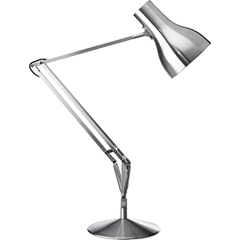 The archetype is design that is so successful and so iconic that it becomes its own category of product and a blueprint for new products in this category. For example: the Anglepoise.
The Anglepoise is an ingenious, adjustable table lamp design. It was design by George Carwardine, an automotive engineer. His approach was purely technical without much thought for the actual appearance and styling of the lamp. The adjustable arm and the springs that hold it in place were so successful though that it has since become its own category of product, just like the Mini and the Moulton bicycle.
License to kill
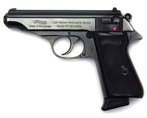
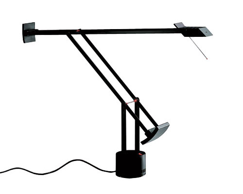
Sudjic makes some interesting comparisons between products that would normally not be compared with each other. For example: the Tizio, a modern desk lamp and the Walther PPK, a small German pistol intended for use by the police. The author finds a similarity between the two in the little touches of red present in the design of both items. In the case of the Walther, a little red dot is revealed when the safety catch is switched off. The red dot indicates danger and seriousess–the weapon is now active and ready for use, ready to kill.
The Tizio, also has the little touches of red. If you look closely you can spot the red used on the switch and on the two joints. The dark color and the modern angular shape represents a very masculine and serious product, but the author goes further than this and links it to the Walther pistol. In this way the lamp isn’t just a source of light, it’s an important instrument that helps you accomplish critical work.
The aura of luxury
Mechanical mass production has given us the ability to produce vast amounts of goods very cheaply. This poses a problem for premium goods: if they can be made cheaply, why pay more? How can manufacturers elevate their products above the rest and give them an aura of luxury? Sudjic writes: “We used to know what mass produced looked like, and what was handmade. This allowed certain forms or materials to come to mean luxury. But industrial production makes objects that hand-craft cannot: the difficult has become easy. And if luxury is based on scarcity or difficulty then, once the effort has been stripped away, so is the luxury.”
To create a sense of luxury today designers have to seeks things that are difficult: using more expensive materials, more materials than necessary, concealing seams and stiches, or the welds of car panels. The luxury item has something that the cheaper one cannot replicate. It may not necessarily perform in any way better than its cheaper alternatives, but it stands aside as something more exclusive.
Another interesting problem that Sudjic points out happens in luxury car production. If you’re going to produce luxury cars you’re going to have to make a profit selling a much smaller stock. The problem here is that the machinery to make cars is very expensive and so will not work economically if you’re only going to use the tools to make a few cars. What happens here is that luxury car manufacturers have to choose what to focus their resources on, and so they focus on the most obvious component of the car: the body. Putting in all the effort and investing the money into the car body allows them to create very elegant and masterfully made shells, but on the downside, they tend to use cheaper parts from other models to fashion the interior. This creates a dichotomy between some elements of the car which are great, like the exterior body, and some which are not so great, like the dashboard.
The value of uselessness
One of the more interesting points that Sudjic raises is on the value of uselessness. Art is generally seen as something usesless, in the sense that it lacks practical utility. It can be argued that emotion is very well served by art, however, when products of art are compared directly to those of design there is a rift. Unlike art, design tends to be considered as work that follows a brief. A company hires a designer to design a product for them within a set of constraints, a product that’s not created for its own sake but for a particular purpose. It’s also work that tends to be replicated through mass production to be of most use, although of course this isn’t always the case. Both of these things, the multitude of copies a given design may have and its everyday usefulness, tend to devalue design when it’s compared to art, if not in the eyes of an intelligent critic then on the price tag of an auction house.
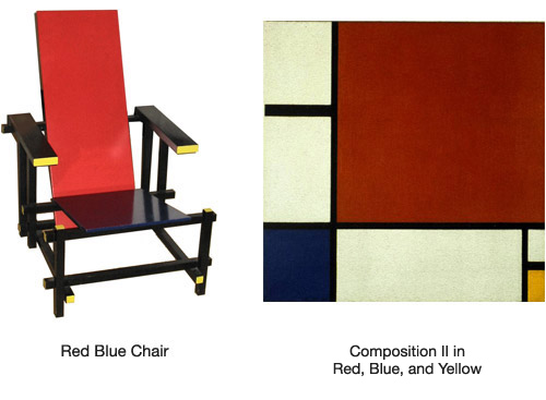
A good example of this bias is the difference in price between Mondrian’s Composition in White, Blue and Yellow, which fetched $8,071,500 in Christies, and Retveld’s Red Blue Chair, a work closely inspired by the painting, that can be purchased factory made for about $2,000. Rietveld’s chair is not particularly useful, but the fact that it can be used and that it can be replicated in a factory does a lot to diminish its value. As a further comparison, the chair Rietveld kept for his own use was auctioned with an estimate of $150,000-$250,000 in New York. Closer, but not by far.
Furthermore, uselessness itself seems to have a value of its own. For example, Sudjic writes: “Rolf Fehlbaum, who in addition to running one of Europe’s most innovative furniture companies is a collector, talks about the paradox of the most valuable furniture pieces in his collection being the failures, the prototypes that never made it into production.” He also points out how misprinted postage stamps tend to be most valuable. Stripped of usefulness, products become collectors items.
Conclusion
I found the book insightful and enjoyable. Sudjic’s writing takes us on an exploration, a tour around the world and history of design, picking items here and there and diving deeper into the meaning behind the way they were made and what they try to communicate to us. The book feels like a gallery tour, which is probably not surprising given that the author is the director of the Design Museum, and this at times made me feel like it lacked a stronger sense of direction. Nevertheless, the book is a very good exploration of how design is valued, how design communicates with us and how it is compared to art, and there is example after example after example to illustrate each point. Definitely a recommended read.