The latest release of Apple’s eBook reading app called iBooks introduced a new navigation mode: the scroll. We’re all familiar with a scrolling interface, it’s what every Web browser uses to display pages on the Web, but until now, the interface used for eBooks was based on that of pages in a book, with the user having to click a button or tap/swipe the screen to move backwards and forward in the text.
The new iBooks scroll interface behaves much the same way as you would expect: slide your fingers up or down the screen to scroll in the desired direction. Is this mode better than the traditional pages approach and are we going to see other readers follow?
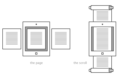
Why pages?
The ancients used scrolls as a primary writing medium for longer works. The word volume, used today to describe a book that is part of a larger series, originates from the Latin volumen, which translates to: a roll. Another familiar word tome originates from the Greek to cut, i.e. a piece cut off from a larger work, which again alludes to the scroll.
In time, the bound book succeeded the scroll as the medium of choice for written works. The greatest advantage of the book is that it allows the reader to access any location in the writing at any time by opening the page they want. This is very difficult with a scroll since to get to a different location in the writing you would have to spend time rolling and unrolling the scroll.
The scroll allowed only for sequential access, while the book gave you random access. An example of this in modern times are the old audio cassettes that you had to roll through manually to get to the song you wanted, versus CD players (and now digital players) that could jump across songs. The book composed of bound pages was compact, economical and easy to use, all of which made it the inevitable replacement for the scroll.
Pages in eReaders
It is natural that electronic book readers would mimic the form of the book – after all, this is the thing that they’re meant to be replacing. Unlike the computer, which never had an existing legacy, the eBook reader was always the extension of the book, or more ambitiously, its successor. While the personal computer created interface metaphors that suited the flow of information it had to display, the eReader adopted the interface metaphors of the physical book.
But although legacy plays a part in the page based navigation in eReaders, I think there is another, and possibly more important reason. The first “proper” reader to appear on the market was the Kindle from Amazon. It had the unique quality of being both revolutionary and mediocre at the same time. The reader ushered in the era of eBooks, but it was technically and aesthetically an average beast. It was a bud still waiting to blossom.
Due to the technical limitations of the time it didn’t have a touch screen and relied solely on physical buttons for navigation. While you can implement a scrolling interface with physical buttons, the slow page refresh rate of the e-Ink display would make the experience of going up and down very laggy and unpleasant. This leaves page navigation as the only viable option since a single button will now be pushing a whole page load worth of text, and so would not need to be pressed as much. The scroll interface just wasn’t an option.
The scroll returns
Newer tablet devices, like Apple’s iPad, don’t have the limitations of the old Kindle. There are no long page refresh times and the touch screen allows for a very smooth scrolling experience, an experience that is at times so good that it creates an illusion of sliding a piece of paper under your hand.
The first version of Apple’s eBook reading app, iBooks, followed Amazon and the other readers in implementing a page interface. That was the norm. Amazon itself has a set of Kindle apps for various other devices, including the iPad, which also has the very same page based interface. But since the device is no longer bound by the limitations of older technology, does it make sense to use that same interface metaphor based on the pages of a physical book?
The Web has pages, but they’re not really pages. The old word is used to describe something quite different. In essence, a Web page is a location of information. These pages are like water, able to fill up any container, to be resized and reshaped by the varying size and specifications of the browser used to access them. Since the content is not divided up into pages, the preferred method of reading on the Web is by scrolling up and down, often with a mouse-wheel or a touchpad.
Scrolling on the Web works not only because it allows for lesser restrictions on the formatting of the underlying content – i.e. the publisher doesn’t need to chop it up into pages – or because there is no way to account for the dimensions of the device used to access the page or the size of the browser window, but because unlike the old scroll, digital scrolling is no longer sequential. By introducing the “scroll bar” on the side of the browser window, we have gained random access to any piece of content on a page. Unlike physical scroll media which has to be rolled up and down to get to different bits of content, digital scrolls give us the power to jump straight to any location we want.
If the scroll interface works for the Web, does it make sense to use it on eReaders as well? Apple, with their latest iBooks update, seems to think so. I, too, think it makes sense. The scroll interface suits the variable nature of the digital content that it holds, but more so, it gives the user more fine-grained control over the reading experience. It feels more natural to scroll the page on a tablet because it creates the illusion of the physical medium, of a page sliding under your fingers. A scrolling interface also stops unwanted page turns if you happen to accidentally touch the screen. I’ve been trying out the new iBooks and while I think it’s too early to tell which mode is better, so far I really like it.
An argument could be made for pages along the lines of this: it is easier to remember where you are and where certain passages of text are. This isn’t true for two reasons. First: the scroll interface can actually be used to bookmark locations just the same way that the old digital pages could be earmarked. The divide is less clear, but it will get you close enough to where you want to be.
Second: it is true that you can get a feel to where things are in a physical book, but I’ve found that this isn’t the case in a digital book. This is primarily because you don’t get to flick through a digital book – the controls and responsiveness just isn’t there. So while you might remember where things are roughly, it won’t matter what mechanism you use to navigate the book: the digital versions of the scroll and the page are both as useless in this regard mainly because the flicking through is done using a small, kludgy slider in both cases.
Scrolling does require more work from the user, but the work of sliding the scroll using a touch control feels very natural and pleasant compared to turning artificial pages with a button or a tap.
Update 2012-11-04: A note on writing direction
A note must be added here about writing direction. The ancient scroll supports writing both vertically, i.e. if you hold the rolls vertically and write down the length of the scroll in a long column (as in my illustration at the beginning of the post), and horizontally, i.e. having the rolls to the sides and writing in page-like columns in the unwrapped portion. While the former seems to exist, the latter mode is more prevalent. In this way, turning pages in something like the Kindle app could also be seen as mimicking the horizontally held scroll as much as the the pages of a book. The computer scroll on the other hand mimicks the mechanics of the rolls more than it mickicks the actual formatting of the content.