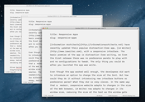
Information Architects have recently updated their popular distraction-free app, iA Writer, with a responsive interface. The basic premise of the app is distraction free writing, so from the first release there was no preference panels to play with and no configurations to tweak. The only thing you could do after you launched the app was write.
Even though the app worked well enough, the developers did want to introduce an option to change the size of the font. But how could they do it without introducing new interface buttons or preference panes? What they did is very clever. In the same way that a modern, responsive website adapts to changes in the size of the Web browser, iA Writer now adapts to changes in its window size, reducing the size of the text as the window gets smaller. The column size remains the same, optimized for readability, but now there are three text size “modes” to use for different types of writing: large font size for composing an essay, medium for jotting down an outline, and small for reviewing what you’ve written.
Oliver Reichenstein writes:
Inspired by our deep experience designing for the web, we’ve given Writer for Mac a responsive design, changing the font size based on window width. This maintains the text’s typographic proportions, zooming in and out without reflowing the text. I don’t know why it took us so long to find this obvious solution. However, given that no one else has done it, the simplicity of this solution is perhaps not as obvious as it seems in hindsight.
It’s a very clever solution, the sort of thing that seems obvious after you’ve reached it. It’s an interface without a visible interface, a way to change the behavior of the app without the need for preference panels, shortcuts or buttons.
Can this idea of the responsive interface be used for other apps? I think so. For example, the popular email app, Sparrow, has two modes of viewing email: a single list of emails, or the same list of emails with a message panel on the right, which shows you the contents emails as you click on them. To show or hide this panel you have to go to “Window” options in the menubar or use the keyboard shortcut. It seems to me something like this is ideal for being triggered by a change in the size of the window. Make the window large and the message panel will appear. Make it small and only the list of emails will show.
The key is to think of “modes” of use. Do your users use the app in various scenarios that rely on window size and/or the amount of tools needed? If they do, as in the case of iA Writer or something like an email client, then a responsive interface could probably work really well.