I’ve just been browsing a site of a service that I’m trying out, and while I like the site and a lot of the interface, I came across a little design hiccup. One of the sections had a tabbed navigation menu that didn’t quite work. Here’s a screenshot:
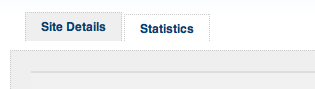
Can you tell which section I’m currently in? Could be “Site Details” because the tab seems to be bigger and the same color as the grey area below? Could be “Statistics” because it looks attached to the white area underneath? It’s not easy to tell, and this really confused me as I clicked the wrong tab by mistake.
Tabbed menus have become one of the most popular ways to implement navigation. That’s because tabs not only look good, but they depict real life folder tabs, which makes them instantly familiar and their function obvious. They also show which section of the site or web application you’re currently in (or at least they should!).
Here’s my 5 steps to ensure your tabbed navigation menu is perfectly implemented:
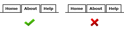
1. Connect the active tab to the content
In the example above I was actually in the “Site Details” section, but because the tab isn’t connected to the content it’s not very obvious. The active tab should always flow into the content area to show the user where they’re currently at.
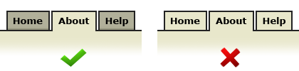
2. Make other tabs a different color
To make the active tab more obvious, change the color of the other tabs. If you’re depicting 3D style tabs, color the other tabs in a darker shade to create depth. You can also add a drop-shadow for greater effect.
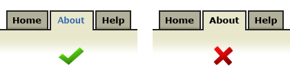
3. Change the font color on the active tab
Changing the font color will give your active tab even more differentiation, and will allow people to quickly scan the navigation for the other pages available to them.
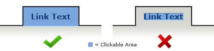
4. Have the link area span the whole size of the tab
Set the height and width of the link itself to cover the whole area of the tab image. This makes the tab more conformable to click because of the larger click area. You can do this by increasing the CSS padding property applied to the tab anchor.
5. Make sure the landing page has its own active tab
When the user first arrives at your site or web app, they’ll notice the tabbed navigation. If none of the tabs are active, the tabbed metaphor will become less obvious because they’ll look more like buttons. With an active tab present on the landing page, the user will instantly recognize that this is the navigation, and they’ll also see where they currently are.
That’s it – simple. Following a few simple usability principles when implementing the navigation for your site or web app can make a huge impact on how easy and satisfying your site is to browse. Getting these basics right will ensure happy visitors.