A good user interface (UI) is essential if you want your product to be usable, but you must always be careful to not fall into the trap of focusing too much on that interface.
A good UI should fade away, putting content in the front seat – it should be transparent. Sometimes there can be too much ‘UI’ – controls and buttons that are too strong and distracting win over content in their battle for attention.
Remember that the visitor or user is there to do something – they’re not there to appreciate the aesthetic of your buttons and marvel at the style of your navigation bar. If you let the UI take over, if it’s no longer transparent and in the background, then it will dominate content and in turn would be too distracting to use.
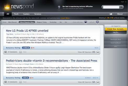
Let’s see an example. Here’s a site called newspond. It collects news from around the Web and ranks it using a popularity algorithm:

It’s a pretty nice system with a very beautiful interface. And that’s the problem. The interface is too beautiful, there’s too much of it – it’s distracting because you cannot easily focus on the news stories. The beautifully crafted (and to some extent a fairly usable) UI is the downfall of this powerful service. The designer has fallen into the trap of focusing too much on the interface, and not enough on the content.
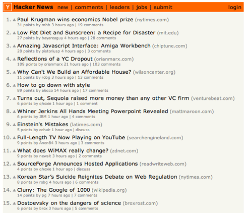
What would work instead? Let’s see an example from a similar site. This is Hacker News from YCombinator, a social news site for entrepreneurs and developers:

It’s very basic. It’s pretty much just content. While I can only see a couple of news stories on my screen on newspond, on Hacker News I can see about twenty. I get what I’m looking for: stories. I can get to them without having to block out the UI. It’s simple, and it accomplishes its function beautifully.
Imagine if Google looked like newspond – would you still use it? I know I wouldn’t. Part of a great user experience is to be able to get to information quickly – very quickly. If you have to block out UI in your mind to read the headlines then that UI has failed. There’s not much ‘UI’ in Google – it’s just a list of links. And that’s exactly why it works. It’s just content.
Experience vs Function
Cutting back on UI style isn’t always the right thing to do – it all depends on the function of your website.
If you’re working on a marketing site, promoting your product or company, then a beautiful UI may work for you. You’re there to deliver an experience, not just content.
If on the other hand, your site’s core function is in the content you publish, then the interface should take a back seat. Make an interface that’s transparent and not distracting to use. Remember that the UI is not the content and not the focus of your site. Getting these priorities right will help you make a great user interface.
What do you think? Would you use Google if it looked like newspond? Post your thoughts in the comments below.