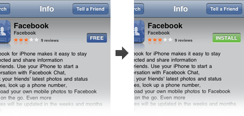
One interesting part of the iPhone App Store user interface (UI) (the one on the phone itself, not through iTunes) is the buy button. The button is the price tag. It looks like this:

On the left is the buy button you see when you load the application page. In this case the price tag on the button is “free”. On the right you can see what happens when you click on that button – it morphs into an “install” button. You then have to push (tap?) that again for the installation process to begin.
I can’t decide whether this is brilliant or silly. On one hand, it serves its purpose very well by not only saving space, but by also making sure the user knows exactly how much they’re going to spend on this app. They’re not going to miss the price tag because that’s what they need to press to buy the app.
On the other hand – is it intuitive? Perhaps a better word to use is familiar – is this UI element familiar? It’s not. At least I haven’t seen this utilized anywhere else. I haven’t had a problem with this button because I’ve actually seen videos of the App Store in use before its release, so I knew exactly what to do when I got it. I’m not so sure how quickly I’d figure it out had I not seen the videos.
What do you think? Is this a good way to do the buy button in this context?