 Wikipedia is a fantastic resource and I’m sure many of you use it all the time – and probably even contribute – but I think it’s lacking terribly in one area: design. Sure, it may have worked fine when it was just starting out, but for a site of its magnitude today the design and usability are really at a much lower level than they should be.
Here’s what a typical Wikipedia page looks like:

Let me highlight some of the things I dislike about the current design:
Languages more important than search on the front page.
I can’t speak for everyone, but my own experience is that I normally just need the search. Sure, you may need the ability to select your language, but at least put the search bar in the front seat, above the language selection list.
Tiny navigation tabs at the top of the page -- that don't even act as tabs.
![]()
Is that size 8 pixel font? There is a big difference between making an interface that doesn’t get in your way and making a navigation bar that’s just too small to read and uncomfortable to click on. Those tabs really should be two times larger and they should act like tabs with the active one connected to the body of the page.
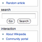
Tiny search box hidden in the sidebar.

This one is really frustrating. Not only is the search bar tiny on Wikipedia pages, it is actually hidden in the sidebar between a bunch of links. It’s so bad that I use Google search instead and append “wiki” in front of my search terms in Safari (still waiting for Chrome on OS X). Search is important and should be placed at the top of the page, similar to Google.
Too many links in the sidebar, rendering it useless.
What are those links anyway? Featured content? Random article? Contact links? The sidebar needs cleaning up – all the utility links should be placed somewhere else (footer) to keep the number of remaining essential links scannable.
Confusing icons in the article editor.
![]()
Wikipedia really needs to get a simple GUI editor. But that’s not a huge issue, I can live with a plain text editor. What’s worse is the toolbar of icons at the top of the text edit box. There’s a big set of icons squashed together in one long line, and I can’t honestly tell you what most of them do without waiting for the little explanation to pop up when I hover over. They should break up the long line into related items and use better metaphors for the images.
No hierarchy of elements.
Perhaps the worst thing about Wikipedia’s design is just how basic it is, without a clear hierarchy to guide your attention to the more important elements. There needs to be better grouping of items and navigation should really be redone from scratch.
I really like Wikipedia, but I think today is definitely a good time to think about a redesign. What do you think? I’d love to hear your thoughts.