There is one attribute of good design that I often see overlooked: restraint. Restraint in design is the quality of holding yourself back and implementing something which solves the problem in the simplest way possible. Oftentimes designers want to show off, imprint their own identity on a piece of work or simply get carried away, producing work that is good but losing simplicity and elegance in the process.
Giving your work an identity certainly doesn’t mean you’re losing restraint – it’s actually a good practice – but it may lead down the road of implementing too many design elements for the sake of design elements – things that don’t really need to be there in order to solve the problem. Instead, apply your identity to the core elements – things that you absolutely cannot take out – and throw away the rest. What you’ll achieve is a product that’s simple, yet bears your own mark upon it.
Let’s take a look at a set of modern mobile phones:
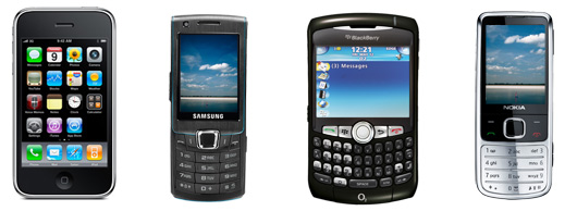
You can see how one phone stands out from the rest: the iPhone. Ok, an obvious example, but it’s only obvious because it’s good.
The iPhone uses the minimal design possible. There is only one button and the whole phone is essentially just one big display. Apple always use simple geometric shapes – there are no unique curves or design elements sticking out – it’s just symmetrical curves, circles, rectangles and lines carefully arranged to form their iconic minimalist, industrial design.
The other phones may feature fashionable, sleek shapes, but they lack simplicity because these shapes are unique to each phone and there are too many elements involved. There is the keyboard, the accept and decline buttons, the Ok and Cancel buttons, menu buttons in some cases, and also the button wheel. The lines and curves are not made out of simple symmetrical shapes – they’re unique to each phone. Yes, this makes the new phones look sleek, but it also makes them look less iconic and less memorable when compared to the brilliant simplicity of Apple’s design that uses only the simplest shapes.
You can sketch the iPhone with just a few lines and the resulting shape is clearly identifiable.
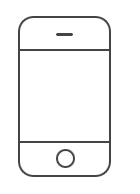
This is minimalist design. It’s iconic. Of course minimalism isn’t a requirement for creating successful designs but by reducing the phone’s construction to the bare minimum and composing it out of simple geometric shapes Apple consistently delivers products that stand out and products that people love. The same design principles are seen in all their work: iPods, iMacs, MacBooks and so on.
Restraint plays a huge part in this because you have to stop yourself and think: hang on – I don’t need all these lines and shapes. I don’t need this button here. I can make this whole section out of one piece of material. I don’t need to use these complex lines where simpler shapes would suffice. And so on. Restrain yourself – think about accomplishing your goal with less – what you’ll achieve is simplicity.
Let’s take a look at some more examples of restraint. This is Dan Cederholm’s website SimpleBits:
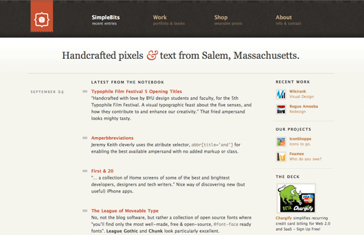
It’s not spartan by any means – there are visual elements throughout, like the subtle background texture in the header and the lighter gradient at the top of the content – but it would be impossible to call it anything other than simple and clean. It’s a beautiful minimalist design that works.
Here’s Flickr:

Notice that there are almost no visual elements – this design really is spartan. If you look very closely, you’ll notice there are tiny rounded corners on the little buttons and frames, and 1 pixel highlights, so the design is by no means unpolished – it’s restrained. It accomplishes its objective by being clean, quick to load and putting the actual content to the front.
Here’s the Basecamp project management app:
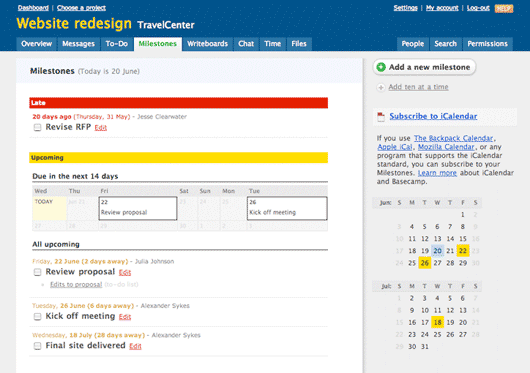
Same thing here – the designers didn’t try to show off or add eye candy – everything is styled very simply. It’s actually fairly polished, but it’s not polished in the sense of being beautiful, it’s polished in the sense of being clear and usable. The designers restrain themselves from adding unnecessary lines, textures and eye candy – what’s left is all there for a reason.
These designs are simple not because their designers lack the skill to create more complicated visuals; they’re simple because their designers restrained themselves from doing so.
Is restraint always good? No, it only works in the right circumstances. Sometimes, you need to forget restraint and embrace complexity. Some work just needs to be complex – needs to be unique, elaborate and remarkable. Not all design should be utilitarian and industrial, some things are made for self expression and art.
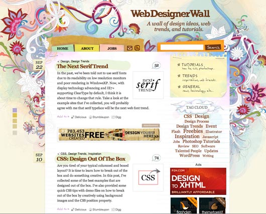
For example, portfolio sites of artists and web designers are usually very intense in use of visuals and eye candy. Here are a couple of great examples:
This isn’t simply design – it’s art. The aim here isn’t to make a clean and usable website, but to create a unique, branded identity and to impress and delight the sites’ visitors.
 On the Red Square, in Moscow, stands an impressive cathedral: Saint Basil’s Cathedral. The cathedral was commissioned by Ivan IV (Ivan the Terrible) and was built in 1561. It’s a very remarkable building, with a unique design and several very colourful and intricately decorated domes. There is a legend that says that the architect of this cathedral, Postnik Yakovlev, was blinded after its construction by Ivan’s orders to ensure that he didn’t build anything more magnificent for anyone else.
And so it is with work like this. Forget restraint and create something truly spectacular – something that inspires and takes your breath away, something that nobody else can replicate because of its intricacy and unique technique involved in its design.
But when you’re working on something like a web app, where clarity and usability comes first – focus on that and restrain yourself from adding eye candy that will do nothing but distract the user from what they’re doing. Simplicity doesn’t need to look barren either, as we’ve seen in the case of products like the iPhone it can be beautiful and iconic. If the visuals don’t help, they don’t need to be there. What’s left can be fashioned by you to create the look and feel unique to your brand.
