Typography on the Web is slowly getting better. These days it is not unusual to see custom fonts in use, and oftentimes, though not always, set in comfortable sizes, with enough padding and line spacing to ensure a pleasant reading experience. And yet, some important typographical tools are still being ignored.
In this post I’ll talk about two such tools: small caps and text figures (also known as oldstyle figures). Both of them are employed in print all the time, but it is rare to see their use on the Web – largely due to the fact that the default fonts (Arial, Times, Georgia) do not support them. But today we have a larger choice of fonts that do, so let’s begin with a short introduction to these typographical features.
Small caps
Small caps are capital letters created at smaller size, typically the same height as a lowercase ‘x’, though sometimes a little higher. These letters are not simply capitals shrunk down in size, but glyphs created specifically for their purpose. The following figure illustrates the difference:
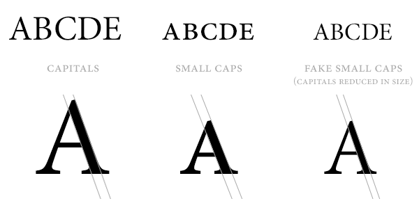
Take a look at the comparison of the stroke width in the “A”. Both the capital and the small cap have an almost equal stroke width. The capital “A” that was shrunk down to the small cap size has a thinner stroke width. Additionally, it is itself narrower in width.
Small capitals are sometimes faked by writing software or web browsers by shrinking capitals, but this often leads to a poor substitute: letters that are too thin and too light to fit in with the surrounding text. Real small caps must maintain a relative visual weight to text surrounding them. The proper way to use small capitals is to ensure the typeface you are using actually has them in its glyph range.
Uses of small caps
Small capitals can be used for things like acronyms, e.g. CSS, HTML. They are often used to highlight the opening of a chapter or an article, and are sometimes used for emphasis within the text. They can also be used for headings. The reason small caps are sometimes preferred instead of capitals for things like acronyms is because they maintain a better visual flow of the text – full caps stand out and look jarring, while capitals set at smaller size fit right in. How well small caps work will obviously depend on the typeface and the context of their use, so it is not necessarily the case that they will work better – the decision to use them or not would have to be based on the specifics of the case.
Text figures
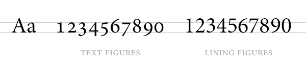
Text figures, also known as oldstyle figures, are number glyphs set at varying heights and sizes to fit in better with lowercase text. You can think of them as lowercase numbers, but while small caps are all the same height, text figures tend to dip below the baseline and above the x-height (the height of the lowercase ‘x’).
Text figures are often contrasted with lining figures, which tend to be the default in modern fonts. Lining figures are number glyphs that are set at the same height as capital letters. The following figure highlights the difference:
Oldstyle figures historically came before lining figures. Lining figures were created primarily for business, i.e. to print prices on labels in shops. Since there are typically no letters used in price tags, it made sense to set the numbers in a neat row. Since then, lining figures have become more popular, and most fonts tend to use them as a default (some fonts even omit text figures).
Uses of text figures
Text figures are useful for setting body text, i.e. the main text in an article, or a brochure, or a book. Text figures are designed to go well with lowercase letters, that is, in the context of numbers being mentioned in the middle of a sentence, and, just like small caps, their use leads to an improved visual flow. Bringhurst puts it best:
It is true that text figures are rarely useful in classified ads, but they are useful for setting almost everything else, including good magazine copy and newspaper copy. They are basic parts of typographic speech, and they are a sign of civilization: a sign that dollars are not really twice as important as ideas, and numbers are not afraid to consort on an equal footing with words.
Robert Bringhurst, The Elements of Typographic Style
There are primarily two methods of using small caps and text figures in websites: OpenType features via the font-feature-settings property and font subsets.
font-feature-settings
OpenType features can be accessed through the CSS font-feature-settings property. There is a variety of features that can be accessed through this property, including ligatures, fractions, and fancy glyph variations. The code for small caps and text figures looks like this:
.small-caps {
	-ms-font-feature-settings: "smcp";
	-moz-font-feature-settings: "smcp";
	-webkit-font-feature-settings: "smcp";
	font-feature-settings: "smcp";
}

.text-figures {
	-moz-font-feature-settings: 'onum';
	-ms-font-feature-settings: 'onum';
	-webkit-font-feature-settings: 'onum';
	font-feature-settings: 'onum';
}
Browser support for this feature is not yet complete. The above should work in Chrome and Firefox. IE supports it from version 10 upwards. Safari does not support it at this time.
OpenType features via font-feature-settings is probably the way we’ll be using these features in the future, though today it may not be the optimal route. Apart from browser support, you must consider the size of the fonts you wish to use. OTF fonts with complete character ranges can be larger than 100 KB per file, meaning that if you want to use regular, bold and italic variations of a typeface, you’ll quickly find yourself serving over 300 KB of font assets. Less of an issue in the future, perhaps, but today this load is still considerable.
Font subsets
The second way to use things like small caps is to simply compile a custom font with just the characters you want – e.g. just the a-z lowercase letters for small caps. You can then put the subset font in front of the full font in your font stack, replacing the characters with those from the subset – i.e. the text figures replacing the lining, or small caps replacing lowercase letters.
For example, if I was using a font called Fira Sans (a fantastic font by Erik Spiekermann, released as open source by Mozilla), my regular font variant would look as follows in my CSS:
@font-face {
	font-family: 'Fira Sans';
	src: url('/fonts/fira-sans-regular-webfont.woff') format('woff');
}
Now, suppose I wanted to have a small caps variant. I would need take the full font and compile from it a new variation with just the subset of small caps letters, a-z. I will then create a new @font-face declaration using the subset:
@font-face {
	font-family: 'Fira Sans SC';
	src: url('/fonts/fira-sans-sc-webfont.woff') format('woff');
}
Here’s the trick. To use the small caps variation, I will actually set up a font stack that includes both the new variation and the full font. This allows us to use the small caps from the subset, and the rest of the glyphs from the full font. The stack will look like this:
.small-caps {
	font-family: 'Fira Sans SC', 'Fira Sans', sans-serif;
}
This technique has its advantages over OpenType features. First, all browsers with @font-face support will work. Second, creating subsets of just the characters we want can drastically reduce the size of the font we serve to our users. A 100 KB OTF font can typically be reduced to around 30 KB with a Latin subset. A small caps only subset can be less than 10 KB. The disadvantage of this approach is that you will have to create these subsets yourself, and depending on font licensing, this may or may not be permitted.
Creating a font subset
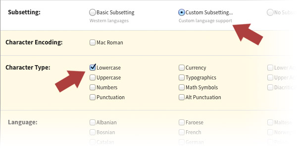
The easiest way to create a font subset is to use FontSquirrel’s Webfont Generator. You’ll obviously need a font that has the characters you need – not all fonts do – but if you have one that has small caps and text figures, you can compile the relevant subsets using the generator.
After uploading the font, tick the “EXPERT” radio button. Under the “Subsetting” section, tick “Custom subsetting…” and select “Lowercase” for a small caps subset. If you are creating a text figures or lining figures subset, tick “Numbers”.
Then, to ensure the compiler picks the small caps instead of standard lowercase letters, tick the “Small Caps” box under the “OpenType Options” section:
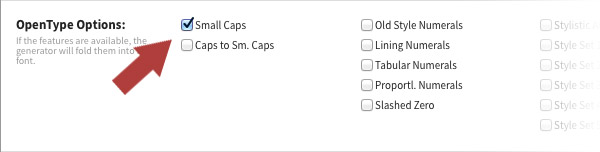
If you are compiling text figures or lining figures, you can select the appropriate option here as well (“Old Style Numerals” for text figures, “Lining Numerals” for lining figures). Other variations are also available here should you want them.
Licensing
Before compiling a subset, check that the font license allows for it. Even if the font is open source, there may be some restrictions on how you can go about modifying it. For example, the most popular open source font license, the SIL Open Font License, allows for modifications, but all modified files must be distributed under a different name from the original. This means that if you want to compile OFL fonts using the Webfont Generator, you must change the name of the font. This must be done inside the actual font properties, not just the file name, for which you’ll need a font editing tool.
Conclusion
So there you have it, two ways to use small caps and text figures on the Web. Certainly not straightforward, but possible nonetheless. Details like these have always been used in the printing world, but on the Web they are all but absent, which is a shame because such typographic details can really elevate the appearance and readability of the page.
If you have any thoughts or comments, tweet me @usabilitypost.