In Part 1 we discussed the merits of a lightweight CSS grid. In Part 2 we talked about how the grid can streamline page templates in content management. Here, in the third and final installment, we will cover some of the more nuanced aspects of implementing the grid in real-life situations. Namely: nested rows and (hold the applause) a flexible grid.
Nested Rows
Every content management system is driven by templates. The beauty of the template is that an entire site can be updated by editing just a single file.
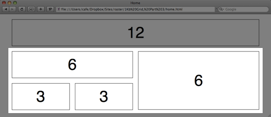
There are times when it is beneficial to divide a column into multiple rows. Take the example below in which there are two 6-width columns side-by-side. In order to subdivide the left-hand column into two rows, we need to introduce nested rows.
First, we need to add a small chunk of CSS. The grid by default sets a width of 960 pixels on the .row class, which we need to overwrite here. You will also remember that the .column class has a left and right margin of 10 pixels (in order to accomplish a 20 pixel gutter). We want to keep this gutter for nested columns as well, but we need to compensate for the left margin of the first nested column and the right margin of the last nested column, thus the attribute margin: 0 -10px;.
.row .row {
	margin: 0 -10px;
	width: auto;
}
Once this bit of CSS is in place, the HTML is quite easy. It follows exactly the same pattern as normal rows and columns, only it is nested inside an existing column.
<div class="row">
	<div class="column grid_6">
		...some content here...
		<div class="row">
			<div class="column grid_3"> </div>
			<div class="column grid_3"> </div>
		</div>
	</div>
	<div class="column grid_6"> </div>
</div>
Check out the nested rows demo for a closer look or just download the code.
Flexible, not Fixed
Fluid grids do seem to get a lot of lovin’ from the pixel-haters out there. The good news is that accomplishing flexible layouts with this grid system is quite easy. The HTML is exactly the same as for the fixed grid. In the CSS, we simply take every pixel width specified, divide by 960, add a percentage sign on the end, and voilá.
The bad news is that a flexible-width grid is not compatible with the nested rows that we just discussed above. It’s one or the other. Sorry.
.grid_1 { width:6.25%; } /* 60 */
.grid_2 { width:14.583%; } /* 140 */
.grid_3 { width:22.917%; } /* 220 */
.grid_4 { width:31.25%; } /* 300 */
.grid_5 { width:41.667%; } /* 380 */
.grid_6 { width:47.917%; } /* 460 */
.grid_7 { width:56.25%; } /* 540 */
.grid_8 { width:64.583%; } /* 620 */
.grid_9 { width:72.917%; } /* 700 */
.grid_10 { width:81.25%; } /* 780 */
.grid_11 { width:89.583%; } /* 860 */
.grid_12 { width:97.917%; } /* 940 */

.column {
	margin: 0 1.04%;
	overflow: hidden;
	float: left;
}
.row {
	min-width: 960px;
	width: 97.875%;
	margin: 0 1.064%;
	overflow: hidden;
}
See the flexible grid in action or download your own copy.
Power to the People
Throughout these three posts we have considered only a 12 column grid. Of course every design challenge demands a unique solution, and a 12 column grid won’t work in every situation. Because of this, I’ve created a simple generator that allows you to specify a desired gutter width, column width, and number of columns, and then delivers a CSS file tailored to your needs.
Visit www.1kbgrid.com to generate the perfect grid for you!